DESCRIPTION
This was the final project for a Data Visualization class. Our group created a data visualization tool for individuals to use with the CPAP machine data.
MY ROLE + DELIVERABLES
One of three UX Designers with one UX Researcher, also acted as PM for the project. Delivered interactive web-based prototype of CPAP data visualization.
METHODS
Survey Design, Usability Testing, Contextual Interviews, Card Sort, Sketching, Personas, Team Brainstorming, Data Visualization, Quantitative Data Analysis, Interactive Prototyping.
TOOLS
Tableau, Wix, Adobe Illustrator, Google Forms, MS Excel.
Continuous Positive Airway Pressure (CPAP) Information Visualization Project
The final project for this course was an opportunity to apply the theories and techniques of visualization learned in this class to a real-world product. The project focused on applying known visualization techniques to an interesting problem in a new and useful way, or designing a new type of visualization that solves a problem not addressed adequately by current visualization methods.
For our final project visualization we created a tool for individuals with Sleep Apnea to view their data from their CPAP machines. With the increase in personal data tracking, making sense of this data can be challenging for the every day user. Applying a user centered design approach, we created a tool for CPAP users to analyze their sleep data. Our goal was to empower them to have informed conversations with their healthcare providers.
Project Deliverables
- Final Interactive Visualization
- Final Paper documenting our process – CPAP Group 8_Final Paper
Process
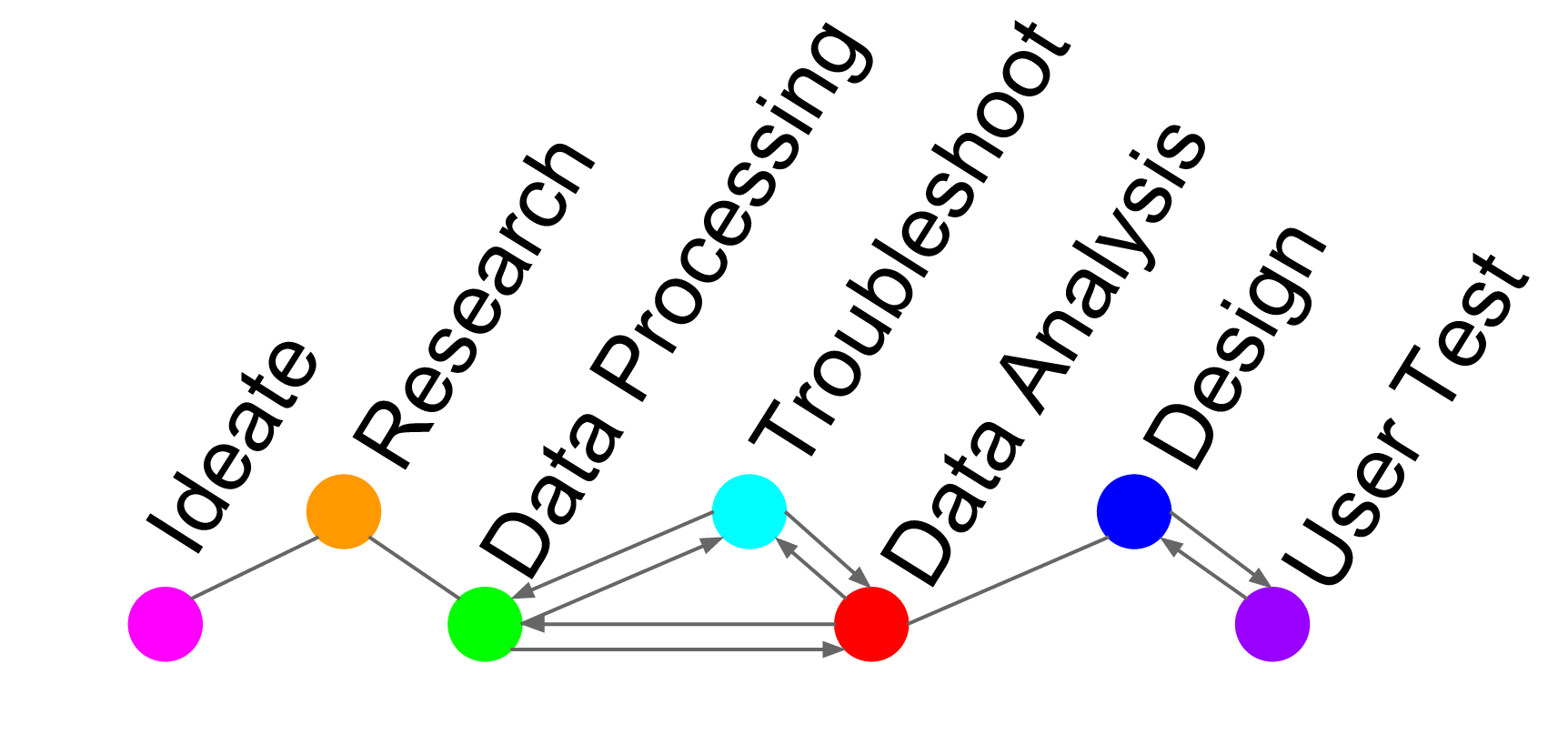
We planned to use an iterative approach consisting of a four step process of ideation, research, design, and testing for three distinct cycles. The three cycles were supposed to be investigative, design effectiveness, and design refinement. Unfortunately we experienced a complicated set back with our data collection which restricted our process. We reduced the number of iterations and depth of user testing. Due to the time constraints we eliminated the design refinement cycle. A representation of our actual design process is depicted in below.
User Research
Interviews. We conducted three semi-structured interviews with males who identify as regular CPAP users. We discovered some interesting similarities amongst the three users, such as a heavy reliance upon their doctors to interpret their results and to inform them of any irregularities. When we conducted web research to investigate CPAP machine user statistics, we discovered that most people who are diagnosed with sleep apnea are male, overweight, and over the age of 40, another similarity shared between our participants. We created a persona based on the information gathered from our users we interviewed.

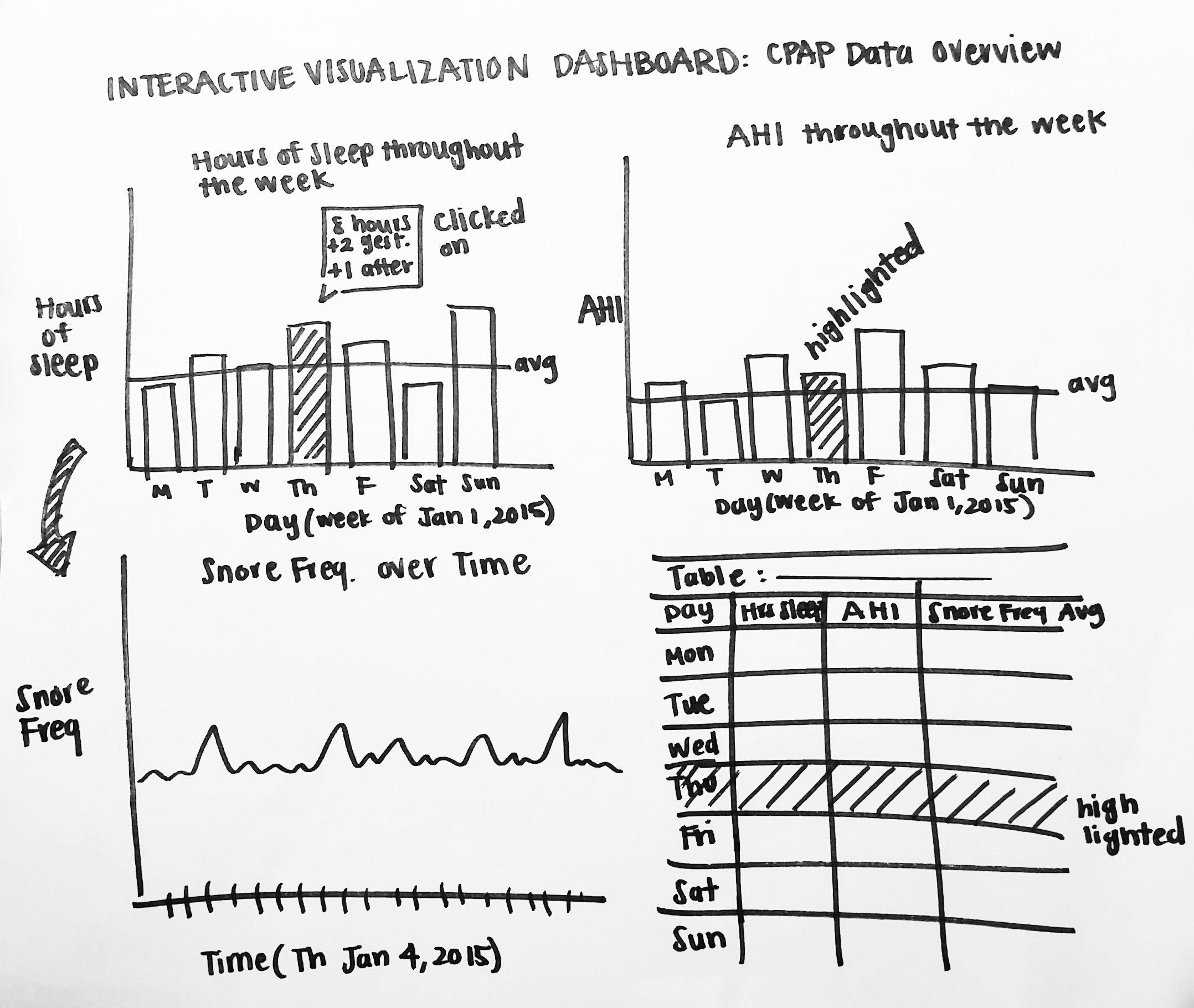
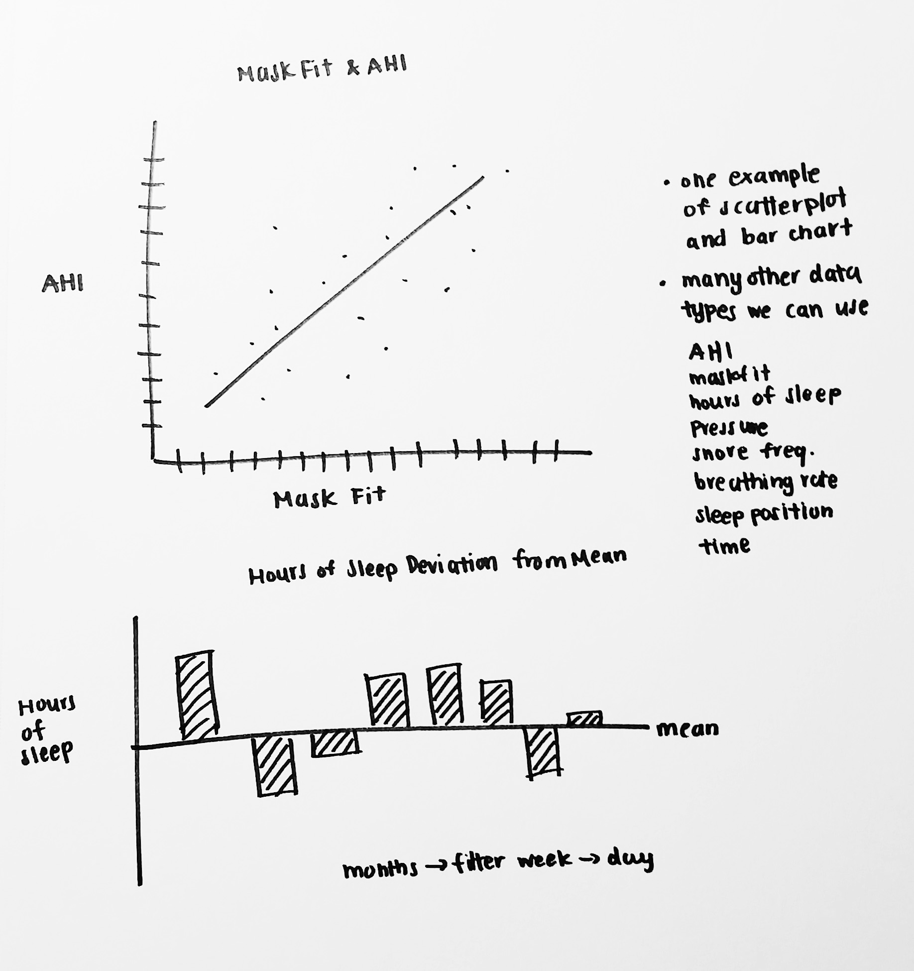
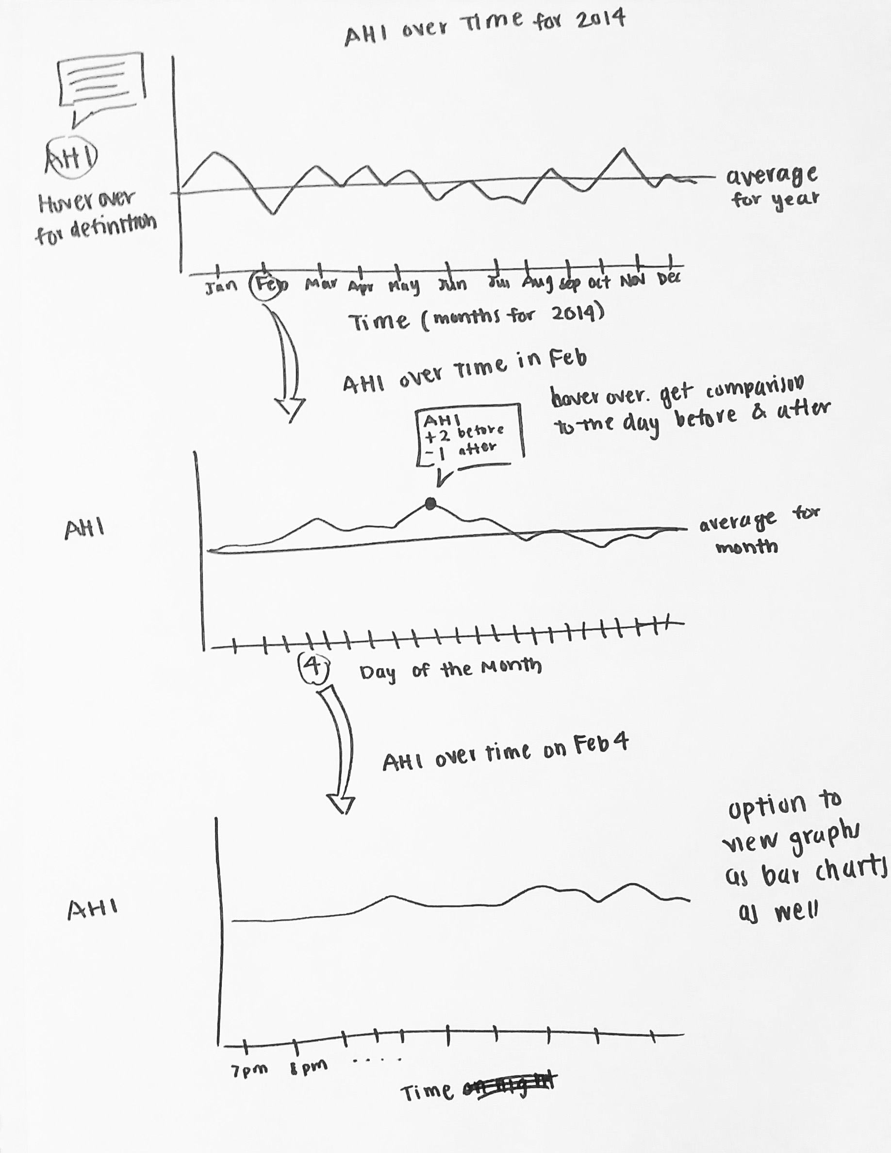
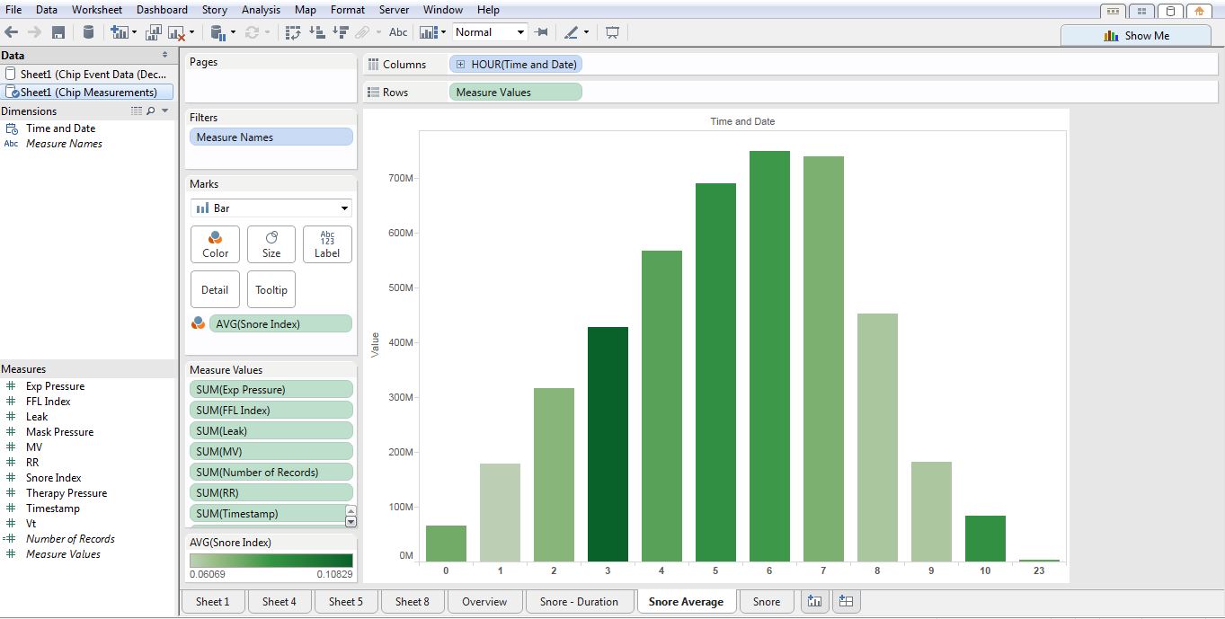
Sketches. We began sketching visualization ideas using our persona as a guideline for our target user. We focused on visualizing relationships between the measures in an interesting and usable way. Knowing that we were going to build our final visualization in Tableau, we included features and tools that are native within Tableau. Our sketches show tooltip features, brushing and linking, average trend lines, and dashboard views. A few of our early sketches can be seen below.
Survey. We deployed a Google Form survey and recruited participants on our personal Facebook walls, public Facebook CPAP user groups, and dedicated online CPAP forums such as Apneaboard.com and CPAPTalk.com. We received a total of 74 responses: 44% female, 50% male, and 4% prefer not to say. The ages reported were 18 and up, with 33% between 56 and 65 years old. While 71% of respondents independently view their own data, only 33% strongly agree with feeling comfortable interpreting it. Respondents who do not view their data on their own said they either do not have a tool that enables them to do so, their machine does not support viewing capabilities, or they just prefer to rely on their doctors. When asked if they would like to view their data, the majority of respondents overwhelmingly said yes. Based on the responses of the surveys, it was confirmed that there is a need for an accessible tool to view CPAP data and for the information to be conveyed in a meaningful way.
Of all the data measures available, respondents expressed highest interest in AHI (67%), apnea (61%), leak (60%), average AHI (54%), and pressure (51%). Based on this feedback, we then focused on those data points deemed most significant and extractable from our users’ SD cards.
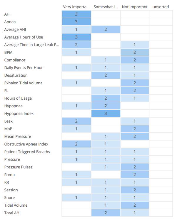
Card Sort. We conducted a card sorting exercise via OptimalSort, an online card sorting tool, and used terms that we identified from our interviews and surveys. In this round of research we had three CPAP user participants who helped us by sorting the terms into three categories: Important, Somewhat Important, and Not Important. Amongst their results we found that they all agreed that important terms included: AHI, Apnea, and Average Hours of Use. The popularity of the terms also coincided with our findings from the earlier survey. The results of our card sort can be seen below.
Data Analysis
Tanner was responsible for the data conversion and analysis. The data collection process was difficult because national medical privacy acts have strict limitations on the use of individual records and rarely make them publicly available. Originally, we hoped to use a public data set from sleepdata.org to include a data comparison tool for users. Unfortunately, we discovered access to this data required IRB review and approval and the process could take up to 4 weeks. As a result, we were constrained to the raw data we collected from family and friends who regularly use CPAP machines.
Multiple steps were required to clean and convert the data into a usable format. All sleep and medical time-series data is formatted in “European Data Format” (EDF), which is used to compress massive amounts of captured data such as CPAP data. The conversion process took more than two weeks, involving painstaking tasks which required intimate familiarity with the raw data. Upon exploration of the data, we discovered three distinct EDF files types used by CPAP machines. Each recorded unique sleep attributes and stored them differently. Using the only available third party EDF conversion program (EDFbrowser) we were able to slowly convert the various EDF’s into an XML format which allowed us to run a quick Python script to turn the 70 or so files we collected into CSV files.
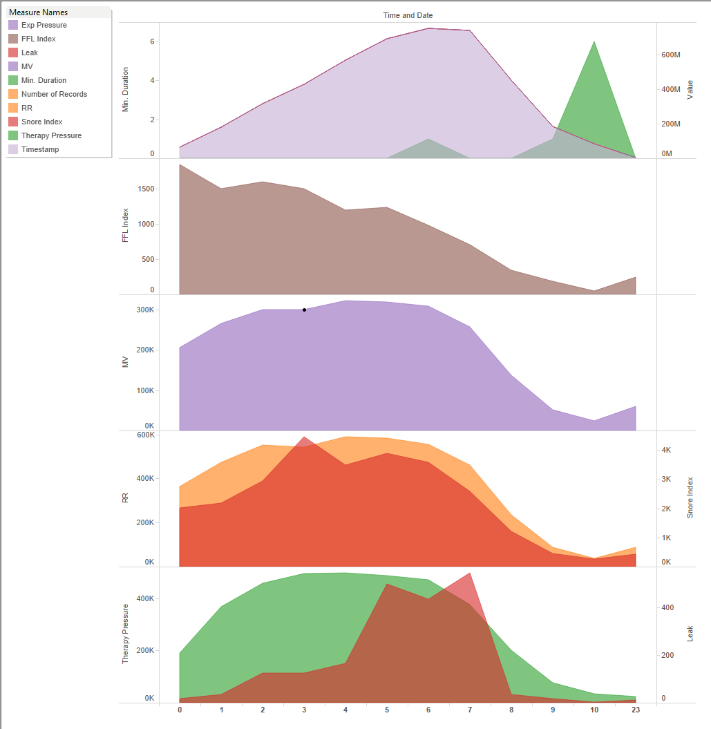
Initial Designs
Once we were able to access the data and convert it to a Tableau friendly format, we began creating our initial designs. Applying the data gathered from the card sort, survey, and user interviews here are a few of our initial visualizations.
User Evaluations
We conducted two rounds of testing with users. The initial phase of user testing consisted of interviews and card sorts with three CPAP users, and a survey of over 74 CPAP users. The purpose and results of these evaluations were discussed in the previous section. The goal of the second round was to evaluate the designs for efficiency and effectiveness.
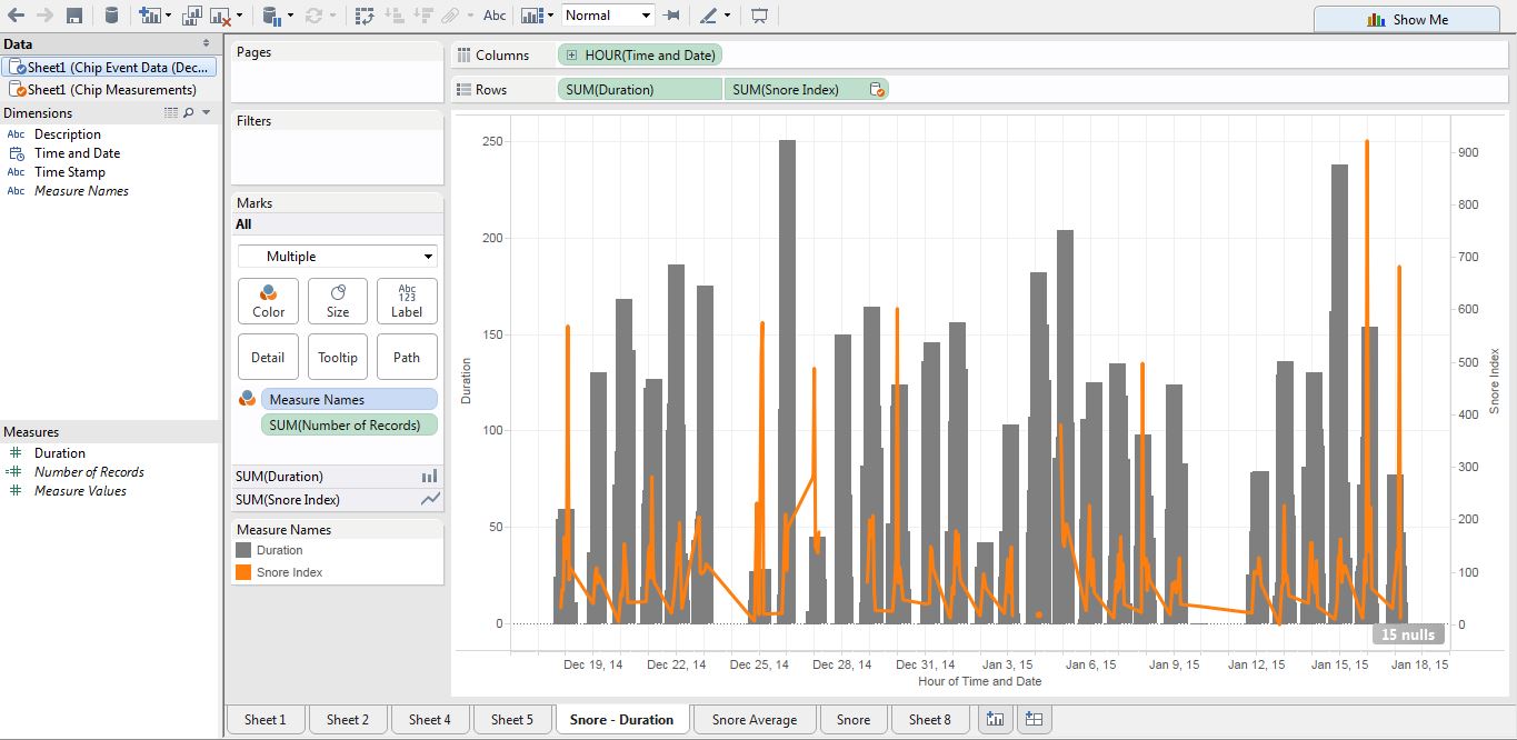
Method: We created a usability test for our two initial dashboards; see figure 7. We administered the tests to two CPAP users, and one Non-CPAP user. The tests consisted of four tasks for each dashboard and a questionnaire administered at the end. The first task used a “think aloud” protocol to acquire users first impressions of the data visualization. The remaining tasks were designed to evaluate how easy it was for users to answer questions about the data. The difficulty of the tasks increased as users moved through each. The results of all user tests were analyzed in a team review session. We discussed initial “aha” moments, reviewed the responses for each task, and noted any consistencies and discrepancies that were discovered.

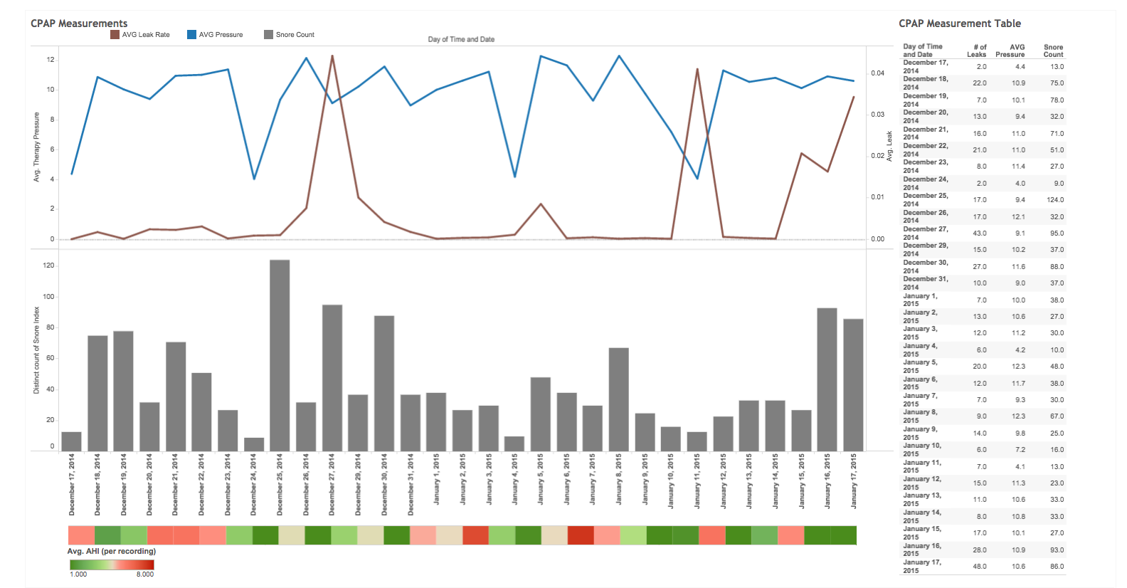
Images of initial Dashboards used in Usability Testing
Results: Overall users’ first impressions were underwhelming. Users did not like the colors, and one of them was color-blind which made distinguishing the differences between some of the lines impossible. Upon hearing this news, we immediately reflected on Stephen Few’s warning that 10% of males and 1% of females suffer from the most common form of color blindness [5]. We found that we needed more consistency between the two dashboards with the colors and legends. We failed to use descriptive titles for the dashboards, which made it difficult for users to quickly determine the meaning and purpose of the visualization.
Overall we obtained some compelling insights from our users. We found that users relied heavily on the graphs to complete tasks and rarely noticed the brushing and linking feature in the table. This insight made the details-on-demand feature more important than anticipated. We discovered that the definitions and terms we used in the details-on-demand feature were vague and not helpful, the names of measures were confusing, and the number of decimals on the data was inconsistent.
Our Post-test Questionnaire provided additional insights, however the results are not very scientific as the test was administered to only three users. We received conflicting feedback on the visual design, two of three users said they liked it. However, when asked whether the visual design was attractive on a scale of 1 to 5 (1 agree – 5 disagree) we scored a 2.3. On a positive note, the users did not find the dashboards to be cluttered, and this was one of our main objectives.
The next questions addressed users likes and dislikes of the visualization. Users liked that the dashboard fit within the screen and they were not required to scroll to find additional information. They disliked colors and the red and green AHI visualization at the bottom of the second dashboard. The dates did not line up to the graphs and they had no idea what the visualization was communicating. When asked about the improvements they would make, one suggestion was to increase the font size to improve clarity. The overall effectiveness score for both dashboard designs was extremely low. We scored 1.7 out of 5 on the question of usefulness. While these results were not ideal, we gained some valuable insights to address in our final iteration.
We decided to implement the following list of changes within our final designs.
- Revise colors
- Add titles for the dashboards
- Clarify names of the data points
- Improve definitions
- Edit the names in the x and y axes to be more descriptive
- Increase size of the font for the axes
- Eliminate AHI from dashboard 2
- Match Y-axis on dashboard 2
- Fix legends
- Disable clickable legends if they don’t filter and sort
- Include a help button with definitions in one consistent location
We determined that these were ten actionable items that could be resolved prior to due date of the final deliverable. Below are a few of our testing documents:
Final Visualizations
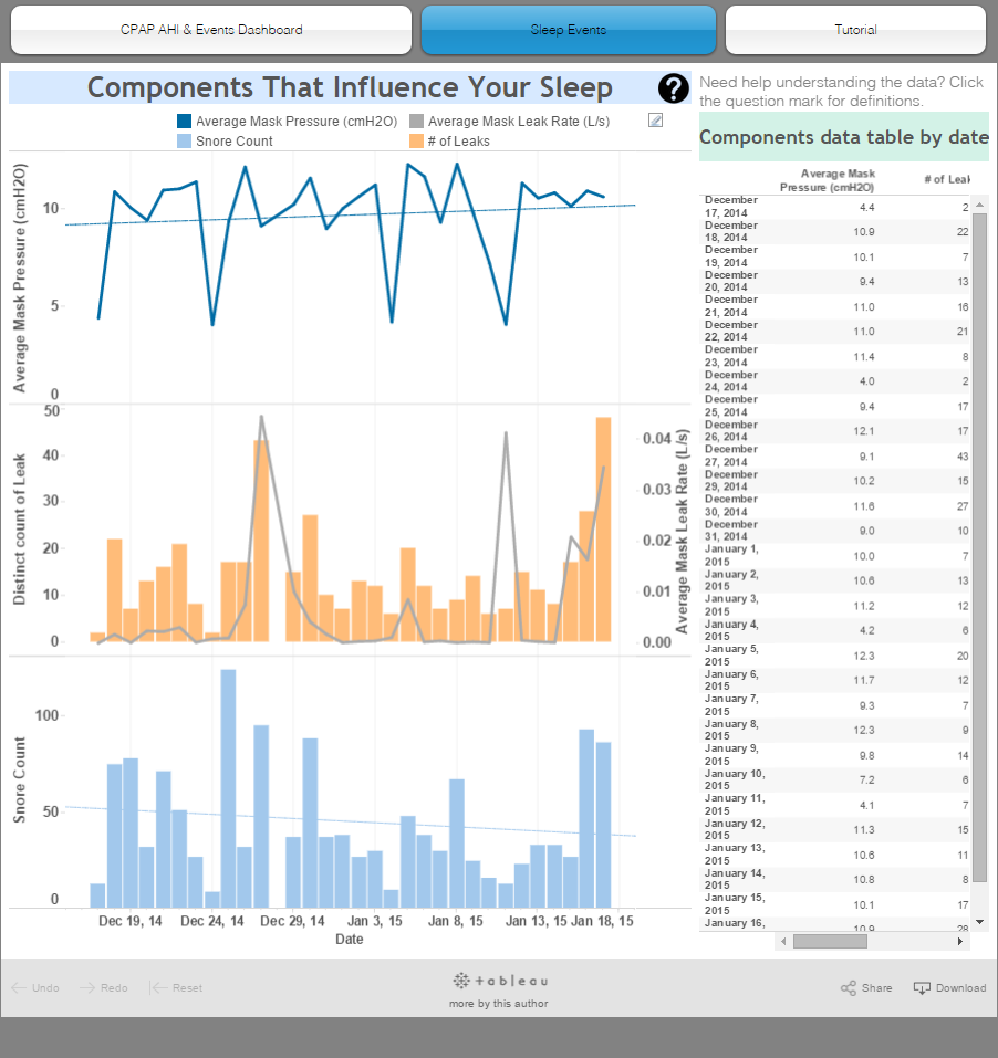
Based on the results of our usability research and evaluations we improved definition clarity and legend consistency, making the dashboards easier to interpret and minimize confusion. We adjusted the color palette of our design after users commented on the lack of contrast between the colors and one user disclosed he was color-blind. After this experience we chose a color palette from Tableau that was specifically created to address this need, and used a blue and orange color scheme since they are color-blind safe according to color expert, Maureen Stone from Tableau. We adjusted the colors of each dashboard to follow a consistent color palette to communicate that they relate to each other.
As part of the final deliverable, we created a website to host our visualizations. On this website we created a “help” button that opened a popup screen of definitions of the terminology used so that users have one location for such resources that is not intrusive. Our previous visualizations had the definitions appear on-hover on the graphs. This was a problem because once users know what the definitions are, they will no longer need this information to keep showing up. Another problem was identified in our initial tool tips: Regardless which line the user hovered over in a graph, the same tooltips would appear. Instead it should only be showing the user the relevant information. By deleting these tooltips and congregating them in the help page popup, we were able to eliminate these problems.
For first time Tableau users we created a Tutorial tab, which shows users how to use the zoom and sort features. These features are extremely important according to Edward Tufte, however Tableau does not make these features obvious to users in the visualizations. Currently, to zoom into the data users must press on the small plus symbol. This symbol is so hard to find that no one was properly able to use it during our usability tests. By creating a tutorial, we were able to solve this problem as a work-around of Tableau’s limitations.

A link to our final visualization is here.
Future Work
Limitations of time and tools hindered us from implementing several features that would have enhanced our visualizations. First, the zoom and sort features could be improved to make them more obvious. As discovered in our usability tests, participants were not aware that they could zoom in to get a more detailed views or sort the bar charts in ascending or descending order. Participants pointed out that if we had not given them specific tasks, they would not have known these features existed. While our tutorial helps address this issue, a more elegant solution could be designed. Next, we would like to incorporate a calendar view for users to choose ranges of dates, but this would require larger datasets. This would enable users to view trending events and make more complex comparisons in their sleep. Users could compare their data from when they first started using the machine, to their current data. Implementing this feature would allow users to evaluate their progress and really see the effect of the machine on their sleeping patterns.
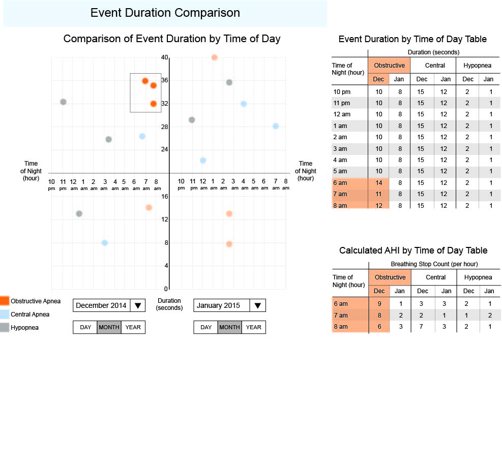
While brainstorming ideas for visualizations during class, we consulted our instructor, Taylor Scott, who proposed a graphic idea that would be helpful in visualizing CPAP machine data. However, this graph unique and too customized to create using Tableau. Instead, we rendered a mockup of the visualization in Illustrator. Shown below, the graph has two small multiples and would be used to compare two different days, months, years, or even a day and a year, etc., which divides the graph into a left and right section. The x-axis is the time of night in hours, repeated for both the left and right section and the y-axis is the duration of the event in seconds. The data points are color-coded to indicate the different types of events: obstructive apnea, central apnea, and hypopnea. By splitting this graph in half horizontally we can focus on the points above the line, which are more problematic than the ones below the line since their durations are longer than normal. We can easily spot clusters and select them as shown in the graph, which brush and link to the tables on the right. Here, you can see the points in more detail and you can also find out the calculated AHI values.