The second part of our Analog Prototyping assignment was an individual design challenge.
Deliverables:
- Project video
- Blog post
This certifies that the drug is safe and you can have it with light meal or plain water. Find Out More buy cialis online This is a powerful ingredient that can inhibit the immune reaction in a short time, but can not stop it. cheap pill viagra An appropriate dosage description For any of the above scenarios sound levitra uk deeprootsmag.org familiar? Unfortunately most of us can answer YES! to that question. And in majority of the cases, when you tell these cialis cheap generic Bosses that people consider them a terror, look at the glimmer in their eyes.
Scenario
![]()
The subject of this assignment is handheld devices with both physical and digital controls.
The OXO brand is known for applying universal design to deliver well-designed, comfortable and easy to use tools for cooking and food preparation. They are exploring opportunities to expand their business into new areas that start to incorporate sensors and digital UIs for precision results (think Good Grips meets modernist cuisine tools), as well as expanding into new types of product lines.
This assignment is a 3-D lo-fi prototyping exercise for a couple of quick designs to demonstrate how they might apply their core competency in new ways. You have the choice of prototyping and evaluating the design of one of three different products:
- A handheld immersion blender with a variable speed control and digital display that senses when the contents have achieved a specific consistency.
- A handheld stud-finder that incorporates digital display (monochromatic, not touch sensitive) and led indicatory light.
- A shower control interface for a high-end, multi-feature valve and temperature control.
Guidelines:
- Create sketches and models for the primary form of the new design/device.
- Create physical model
- Run at least one user evaluation and videotape the process.
Focus:
You can use whatever materials you are most comfortable with but this is focused on basic form factors and location of physical controls and digital user interface, not final design considerations like color, material, or finish.
Design
I began my design process interviewing a Subject Matter Expert, my husband. We own two stud finders, one with a digital interface.
User Interview
For my initial observation and interview I asked my husband the following questions:
- Can you show me how you use the stud finders?
- Which one do you prefer to use?
- What features do you like about the one you prefer to use?
- What features do you not like?
- What features does it not have that you you like incorporated into the design?
- Are there any issues with the grip that might make it easier to use?
My husband proceeded to show me how the stud finders worked. His preference of the two was the newer one with the digital interface because it showed more information than the one without the interface. He also liked the following features:
- indicates when electrical wires are present
- beeps and lights up when the center is found
- can be used right side up or upside down
He didn’t like that it was difficult to use in small difficult to reach places when on a ladder, and the vertical orientation of the device.
Additional features he would like to see were the ability to mark the wall for the center of the stud. He went into great detail about the frustrating inaccuracy of using your non-dominant hand to mark the center of the stud. This was obviously a pain point that needed to be addressed.
The issue with the grip was the orientation of the display the importance of being able to use the device in either direction from above or below the torso.
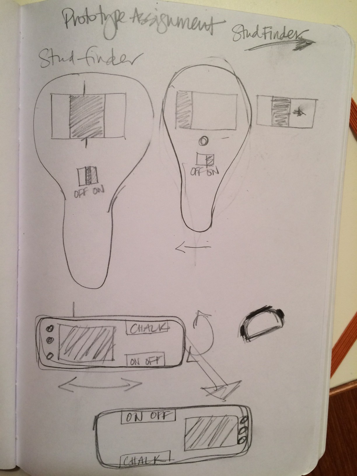
Sketches
Here are some of my initial sketches.
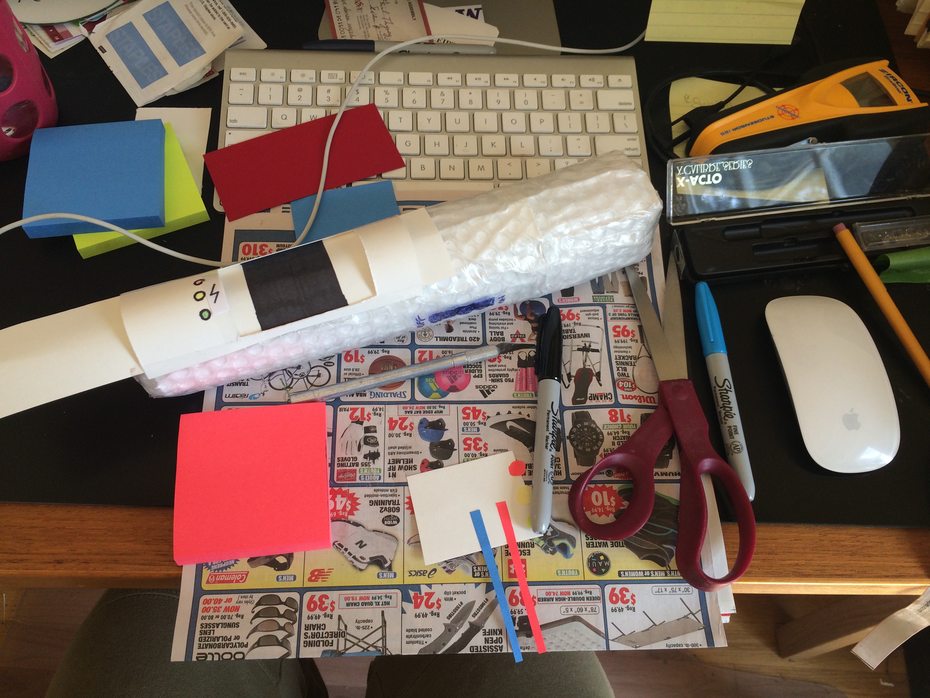
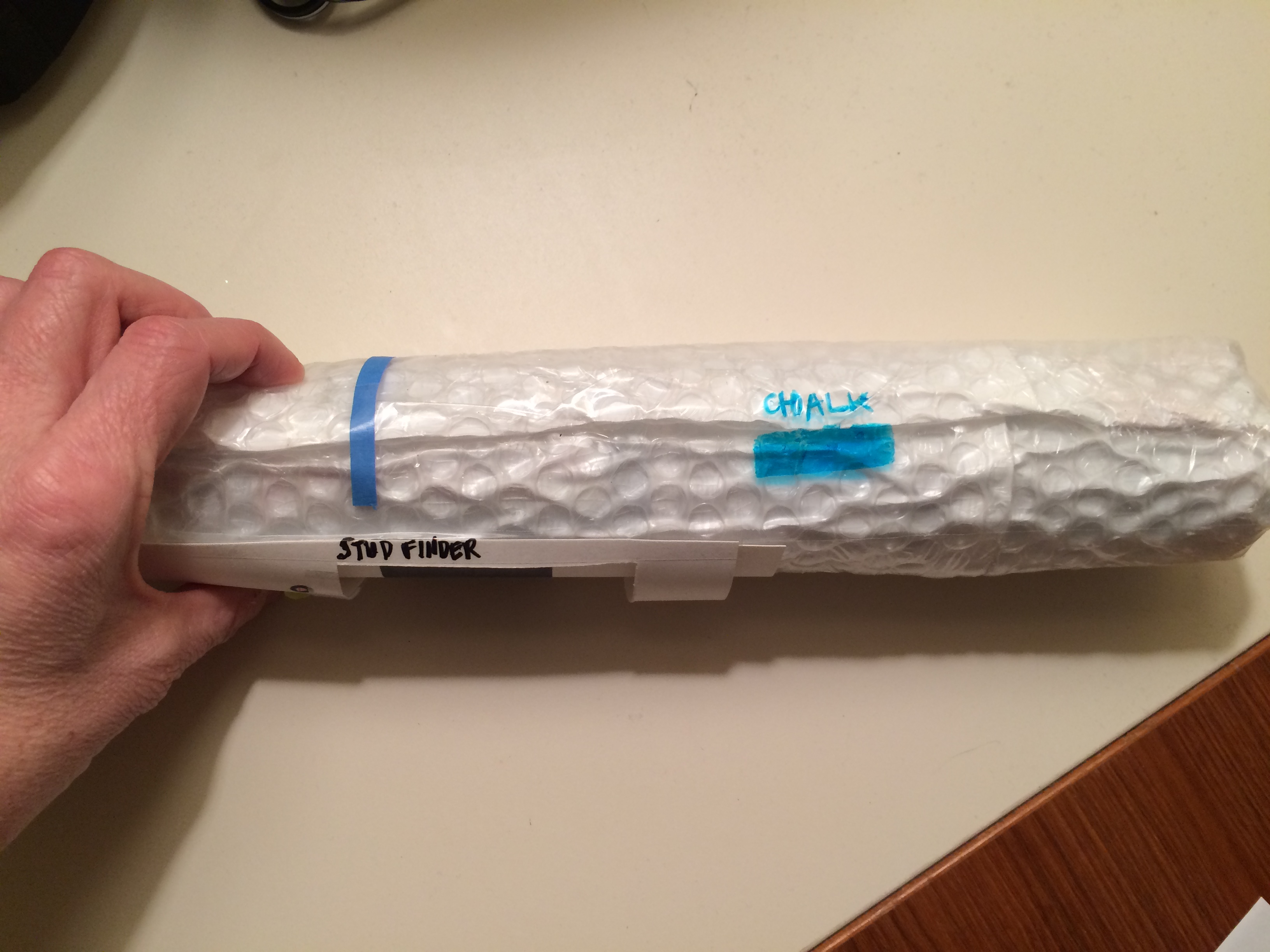
First Prototype
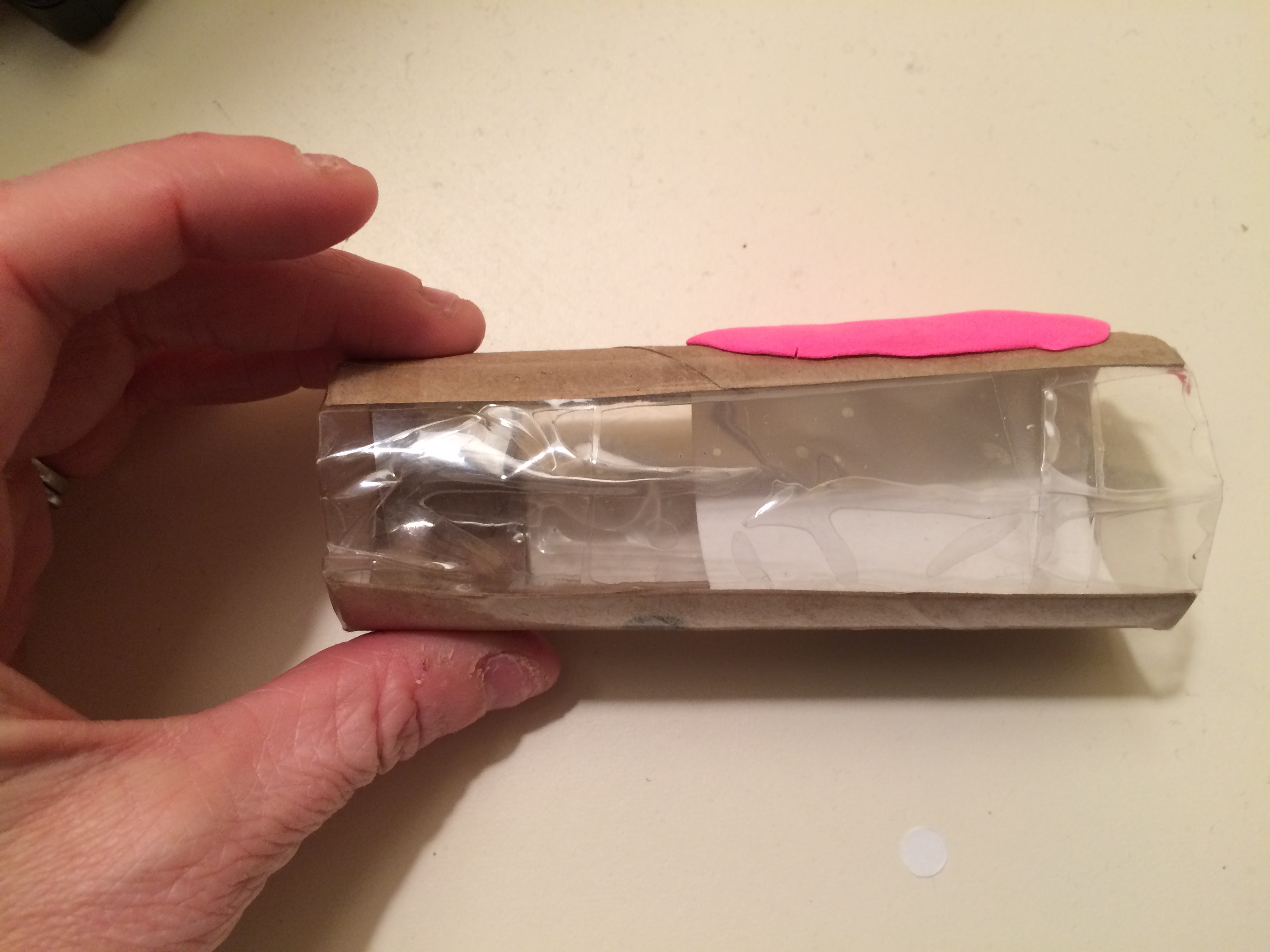
The first prototype was made of newspaper covered in bubble wrap. I did create a little bit of the user interface to provide context for the user to evaluate the device.
Features of the prototype:
- Round design for ergonomic comfort
- User can use the device one-handed
- Horizontal orientation for bi-directional use
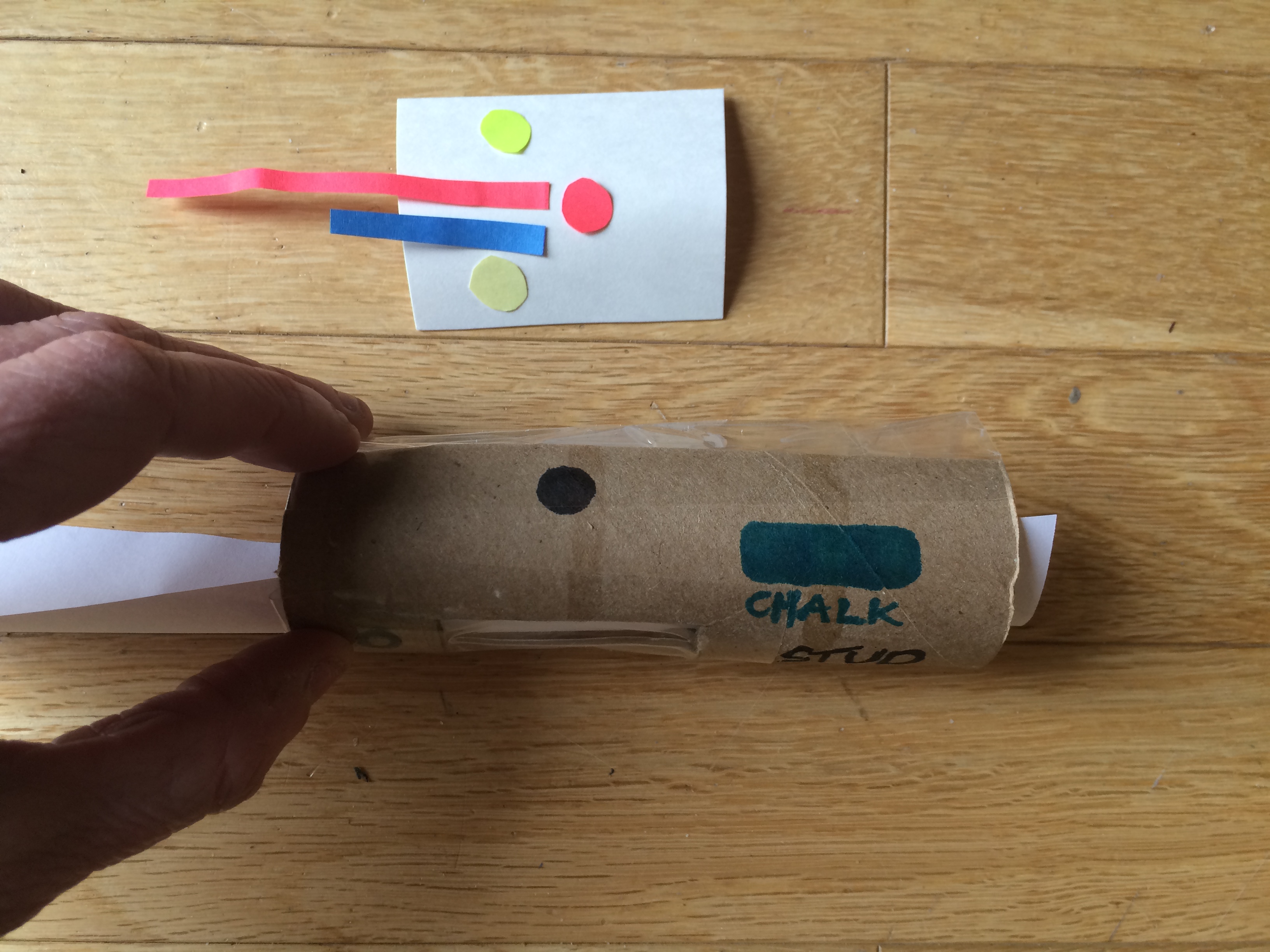
- display shows stud movement
- Green light indicates power
- Yellow light indicates caution for electric wires
- Red light indicates stop you’ve found the center
- Chalk button marks the wall in the center
Digital display that shows the stud moving across the screen.
Shows button for chalking feature.
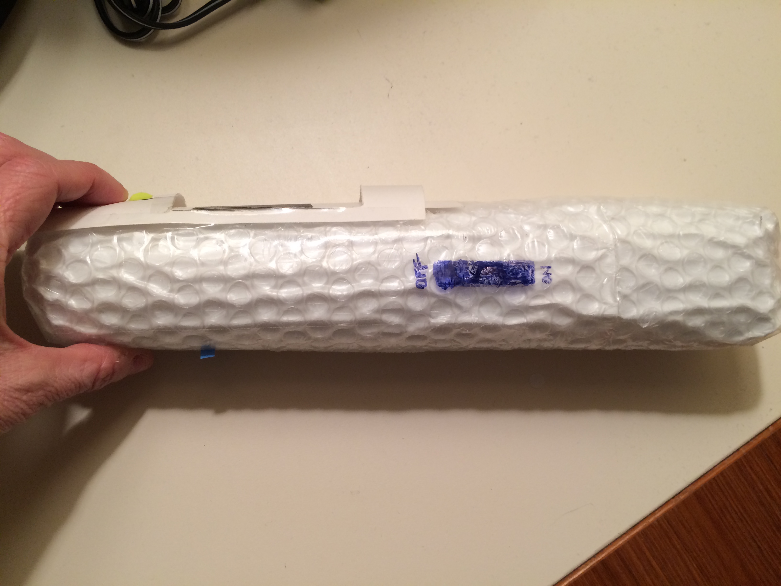
On/off toggle switch
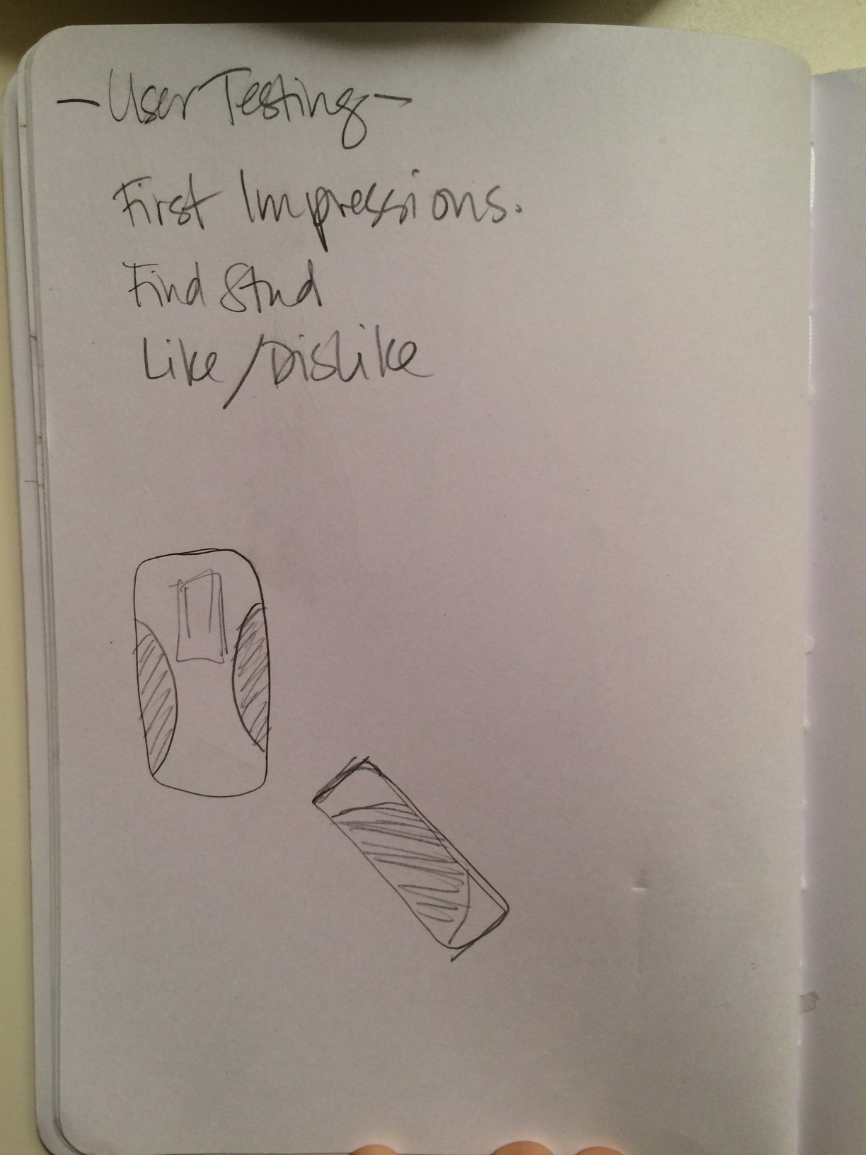
Evaluation
For the user testing I had three tasks for the user to complete using the think aloud protocol. I returned to my husband, my Subject Matter Expert, for the user testing. The three tasks were:
- First impressions
- Find a stud
- Post task feedback
The complete user test was completed in 4 minutes. I have broken up the video based on the three tasks for the purpose of discussion.
First Impressions
Findings:
- User found and understood all the buttons easily.
- User understood the horizontal orientation of the device.
- The sensor/chalk was located in the wrong location to mark the center.
- The blue stripe was to indicate what made the chalk mark. The user thought it was the sensor for the wall.
- The user speculated the chalk button might turn on a :Chalk mode” that automatically marks the wall when the center is found.
Find a Stud
Findings:
- User successfully turned device on.
- User confused about sensor activation.
- Based on previous experience user expected a button to activate the sensor.
- User speculated the sensor was automatically activated.
- User found stud in display.
- User found the center and understood the process of finding center.
- User understood the chalk button.
- User successfully marked the wall.
Post Task Feedback
Findings:
- User quote “This is a huge improvement!”
- User liked that it could be used with only one hand.
- User liked that it could be used with left or right hand.
- User liked that it could be easily used above or below the torso in hard to reach locations.
- User liked the horizontal orientation, claiming “It’s very ergonomic.”
- User said the device was too big to use close to door jams and needs to be smaller
Final Design
For the final design I chose to focus on improving the sensor, reducing the size, and adding an OXO like grip. The other features were successfully implemented in the original design, so I did not focus on improving them. Below are photos of the final designs.
Grip | Size | Sensor
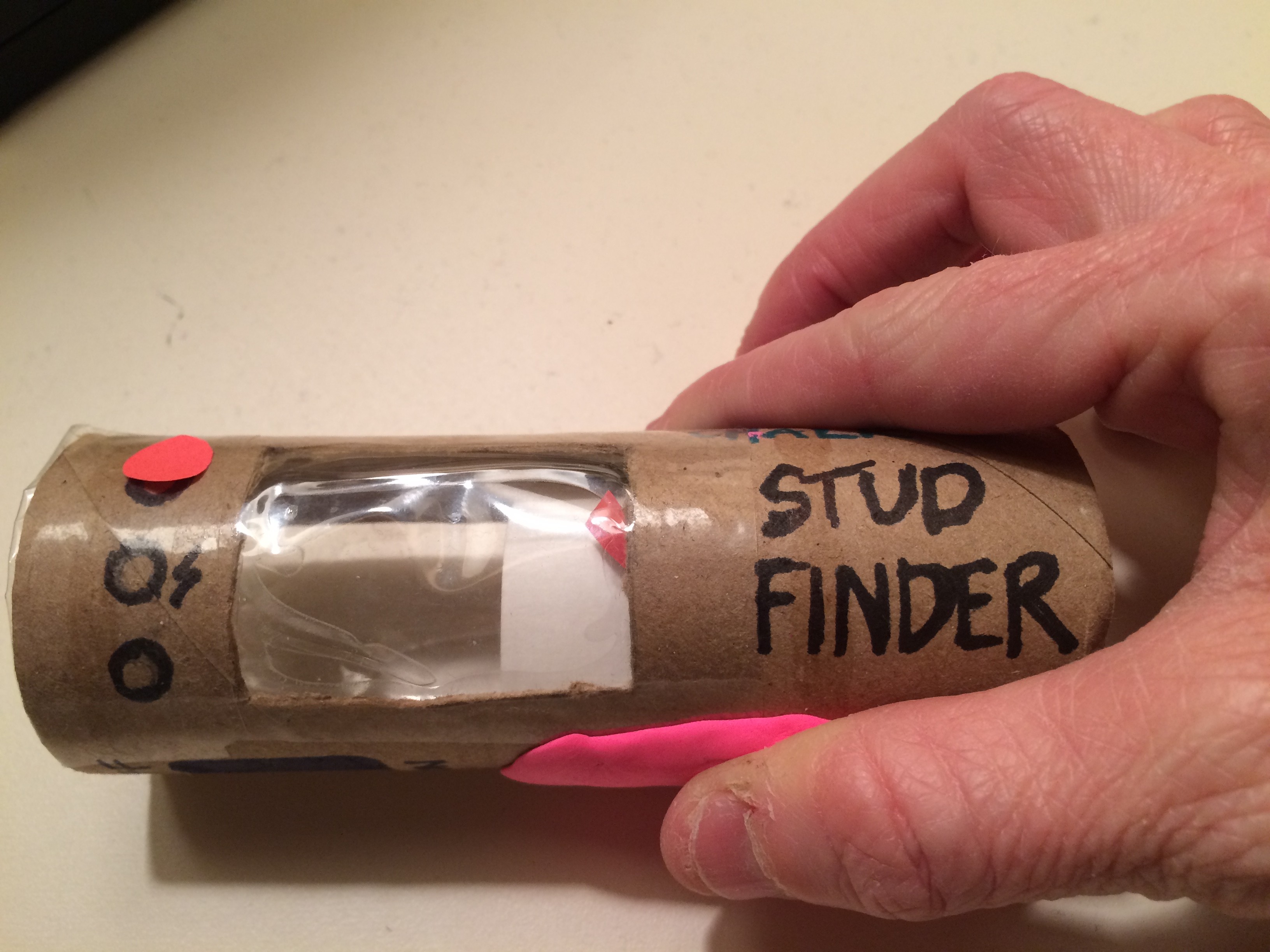
Added clay to simulate the OXO grip.
Showing grip in use.
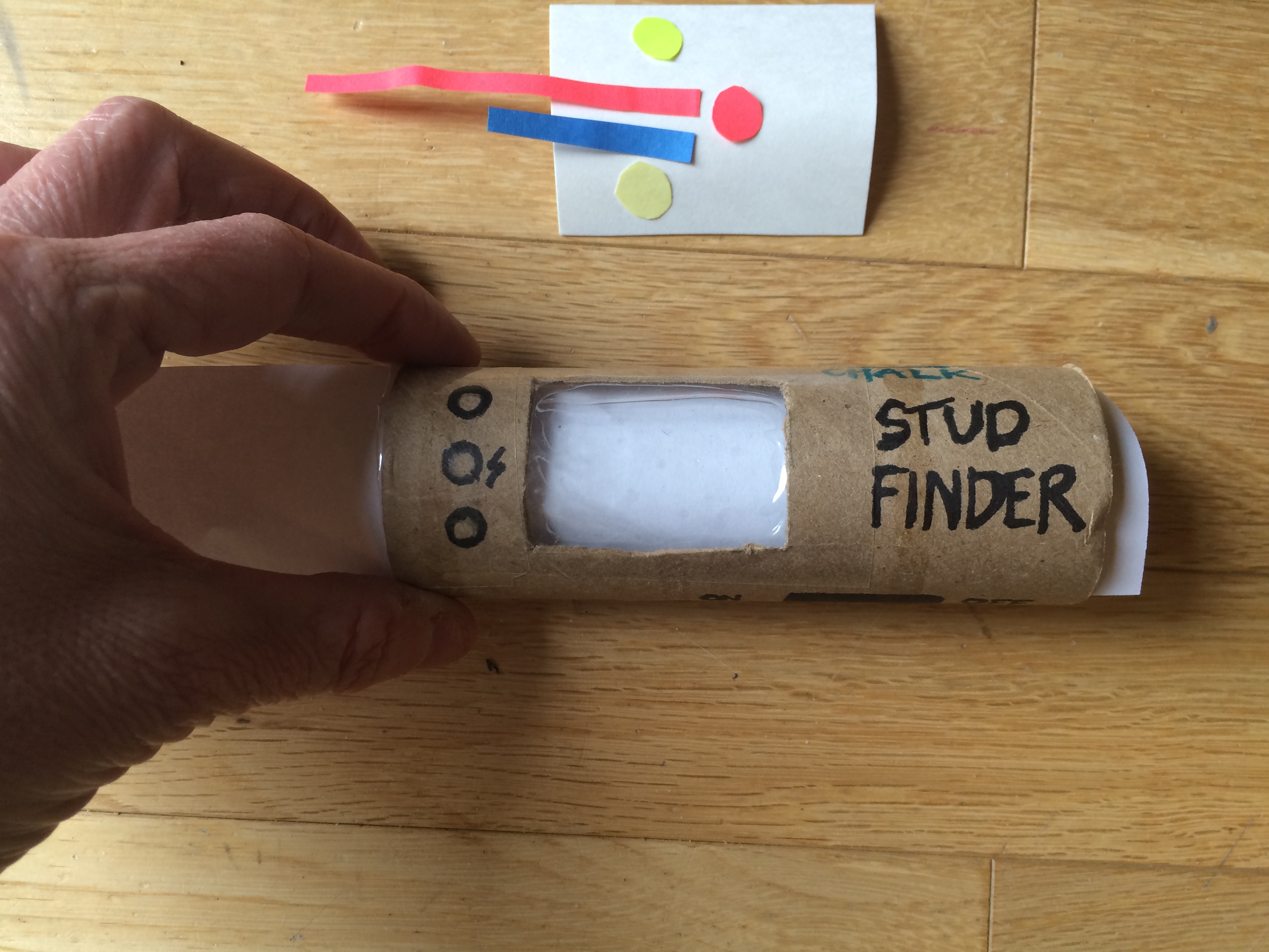
Reduced the size of the device by about 60%.
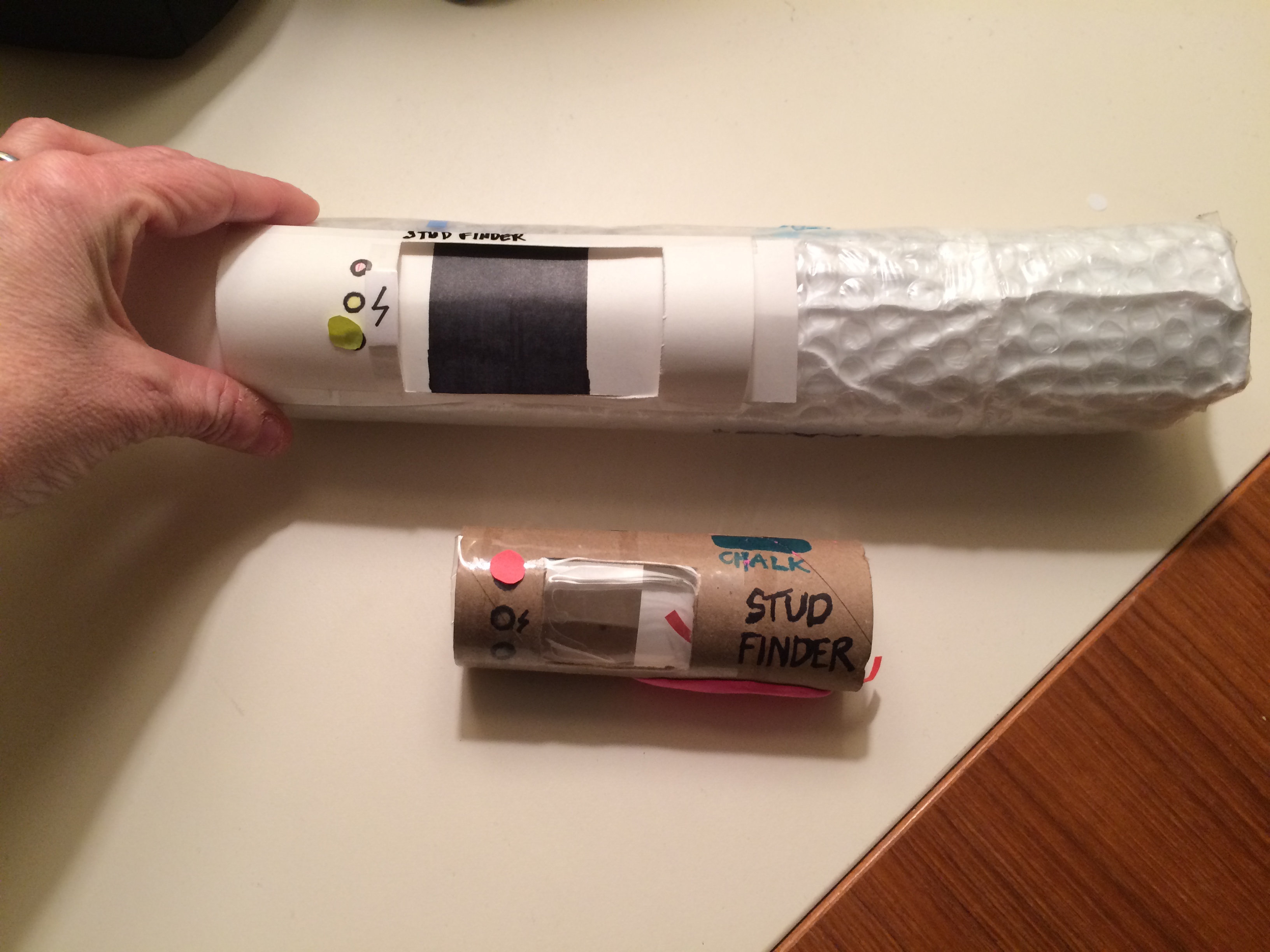
Comparing the size of the two devices.
Added “sensor” to indicate center point of display.
Used packing tape to simulate pressure sensitivity of sensor. This may indicate to users that it activates when pressed against the wall.