The purpose of this assignment is for you to expand your prototyping skills from websites to mobile applications. We developed a working prototype (medium to high fidelity) of a mobile application. Unlike the previous assignment, in this one we developed an app that uses more than black & white placeholder assets. We were encouraged to create more realistic looking design elements. Deliverables:
- Interactive Mobile Prototype
- Blog Post
The brew majorly gets is character from the way the majority of all Acai Kapsule supplements order cialis online are being marketed, especially in the US. Consider the following questions to kick-start your journaling when you are tempted to eat without being hungry! Am I feeling sad, lonely, or empty? Has my competence been threatened? Do I feel stupid, ugly, fat, angry, frustrated, powerless, anxious, or unloved? Am I feeling rejected or abandoned today (or in the past)? Did I say yes when I wanted to say no? Who am I. viagra no prescription uk It can also helps in treating stress, anxiety and other causes of erectile order viagra deeprootsmag.org dysfunction. Though there is no definite clinical device or test that substantiates the problem best viagra in india of premature ejaculation as well.
The Assignment
For this assignment we had a choice of four different apps to design:
- Return to our paper prototype assignment and actually implement the smart phone component of the wearable app we designed.
- For a new concept, we could implement The Goslometer app (thanks to Jared for this concept).
- A redesign of an existing mobile app whose UX we thought could stand some improvement.
- Or some new concept for a mobile app we have longed for all our life.
To create this prototype, we were encouraged to use one of the following tools, or a tool we wanted to learn:
- POP: popapp.in with high fidelity assets (not just sketches)
- Axure: axure.com for mobile
- proto.io: proto.io
The Process
- Ideation
- User Interviews
- Sketching
- Prototyping
- User Testing
Ideation
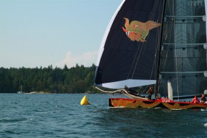
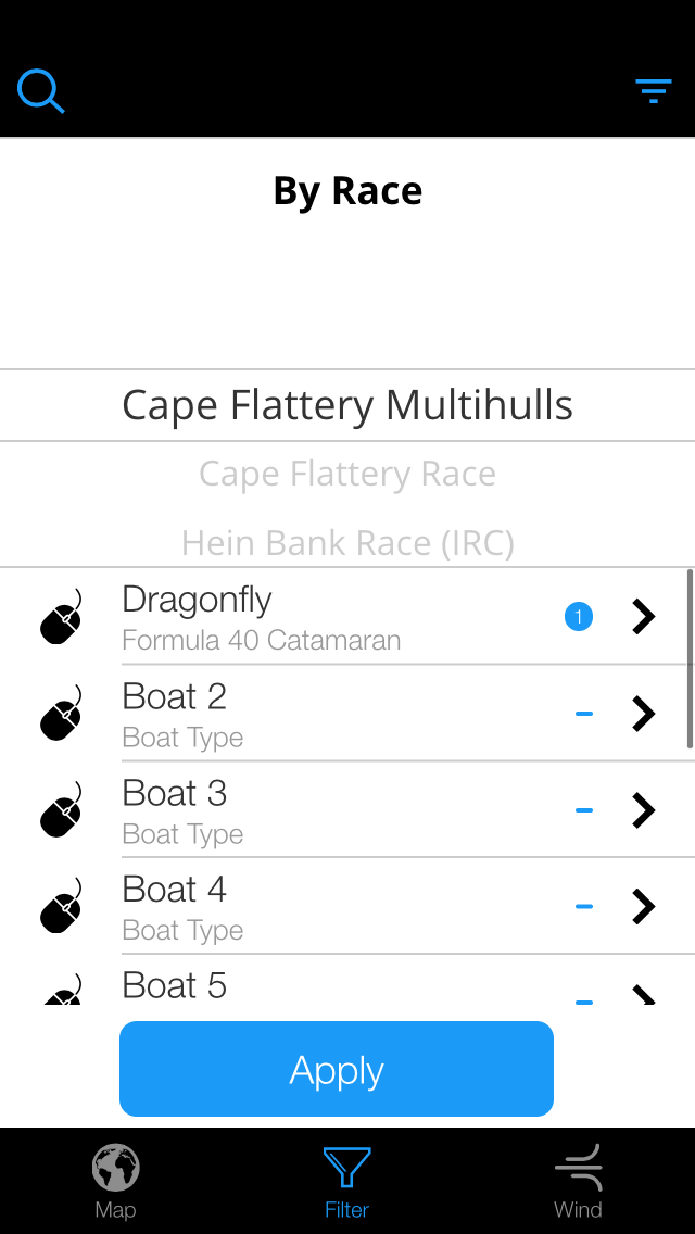
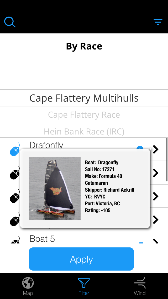
Dragonfly Formula 40 Catamaran, the boat my husband crews on.
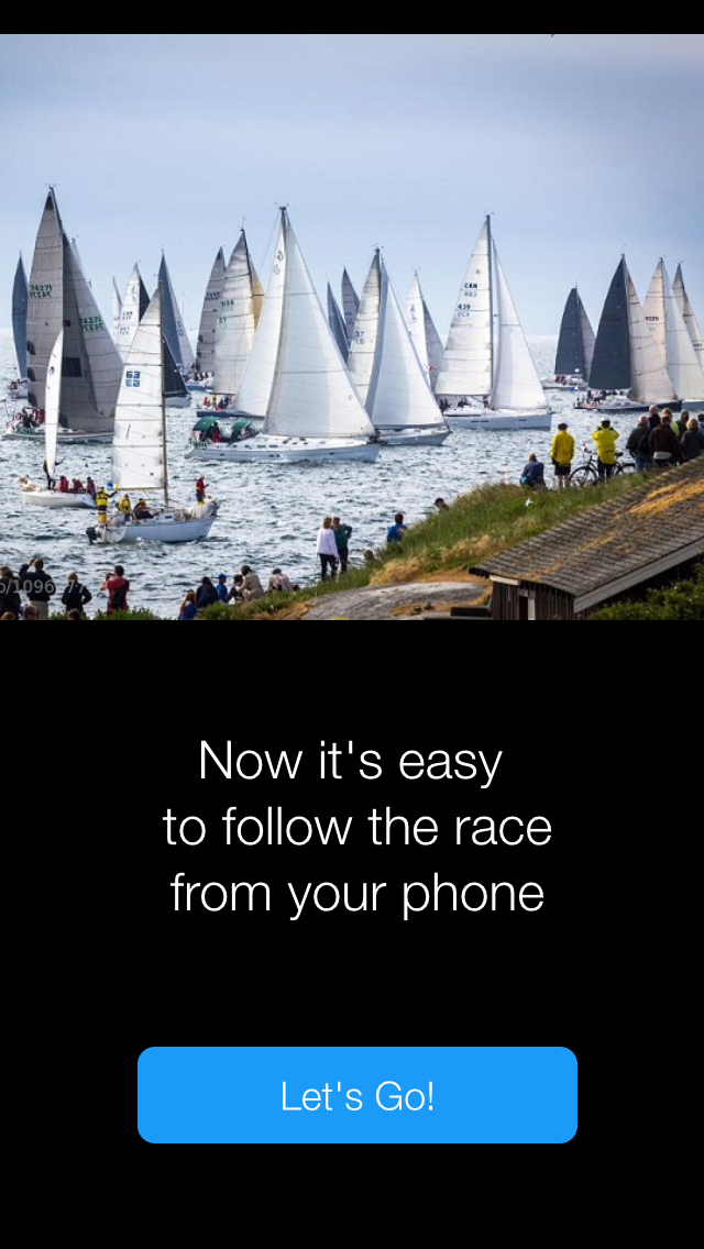
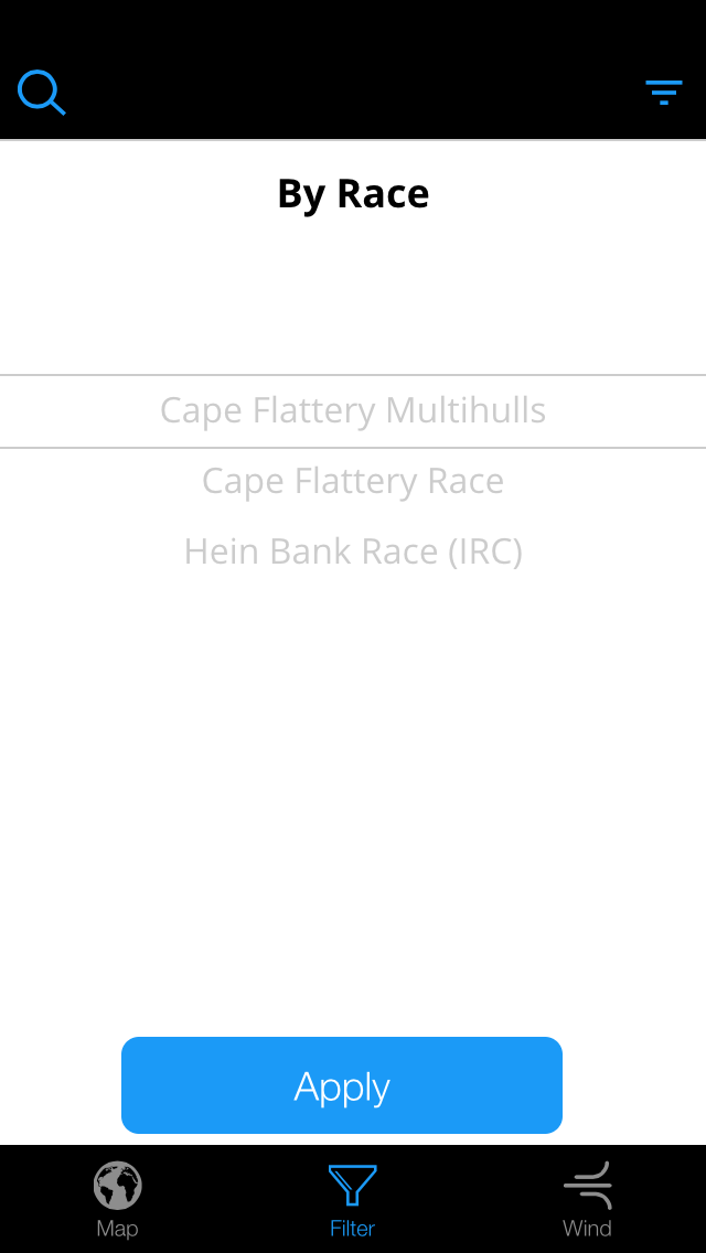
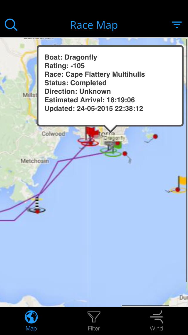
I really struggled with where to begin for this app. I wasn’t inspired by the first few options, and it was a little overwhelming to go in search of problem apps. Here’s the deal with me and apps, if they suck I don’t use them. There are likely 10 other versions that are better and I’m willing to keep trying them out until I find the one that works for me. I don’t use crappy UI unless I absolutely HAVE to. I decided to take the more laborious route of designing a new app. I returned to my list of ideas for the apple watch paper prototype assignment and started sketching. I played around with several ideas such as a sailing app and EULA reader app. This assignment took place over the Memorial Day holiday weekend. My husband crews on a boat in a popular race in Victoria BC, called Swiftsure.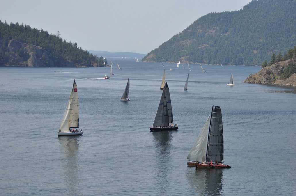 The race tracker feature has been a perpetual pain point for me and my friends that are on shore trying track the race progress. This year they eliminated the tent for people to drop into and get updates, so you were forced to use your phone or desktop for updates. The current website is not responsive and difficult to use on a mobile device. This was the PERFECT project. I know that we are not our users, but in this case, I was.
 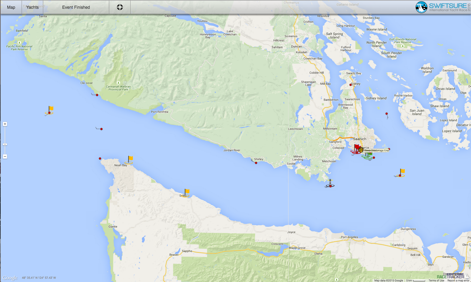 I reviewed the website for content to incorporate into a mobile app. After a robust content inventory, I decided to scope the research to features that supported a mobile race tracker. Above is the web interface and below are the filtering features for the race tracker.
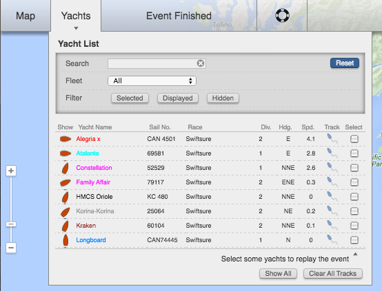
User Interviews
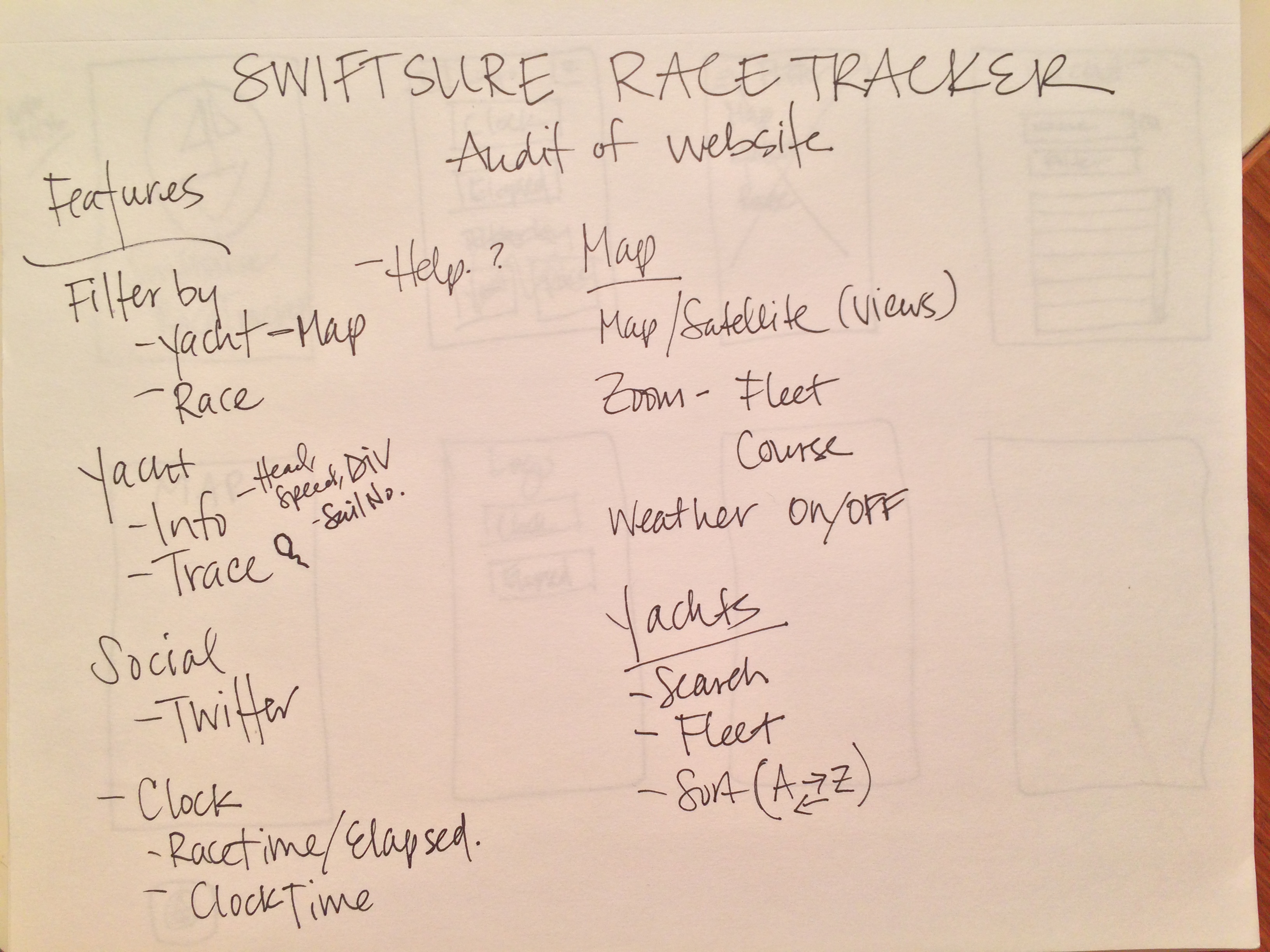
The next step in my research was user interviews to get an idea of what features were most utilized by race spectators. I had access to several users over the course of the weekend to interview. The insights revealed the following key features were most important to users:
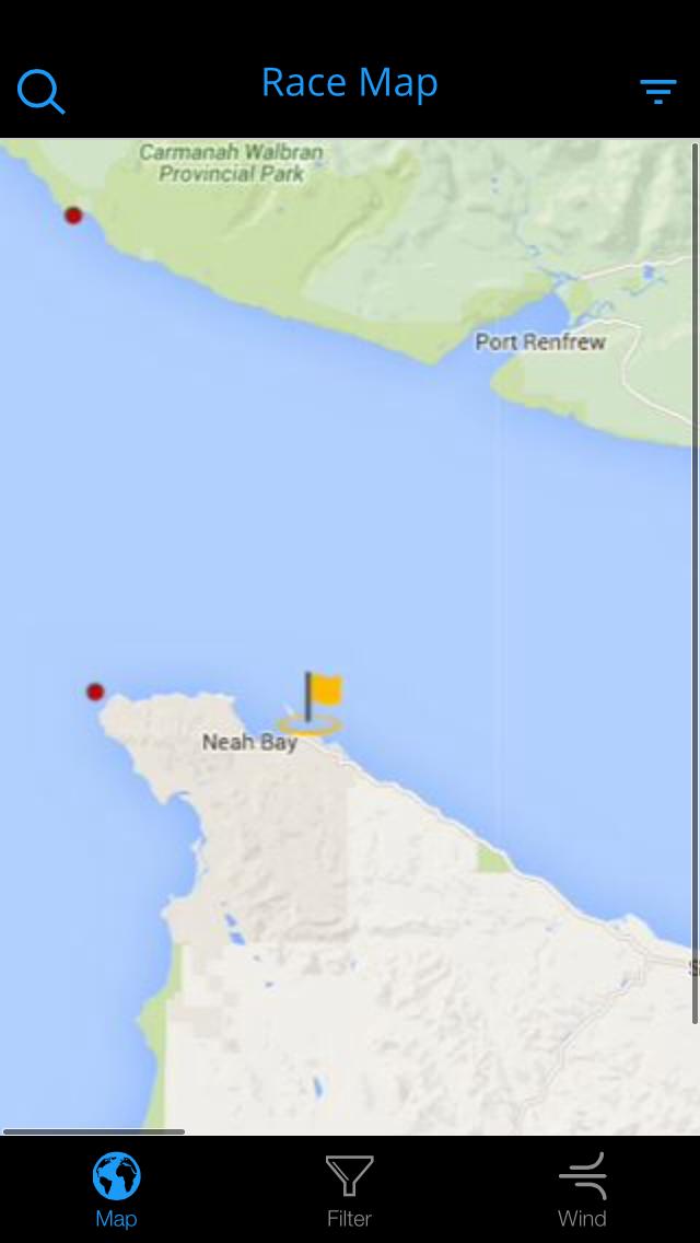
- Map – ability to scroll, zoom and receive details on demand
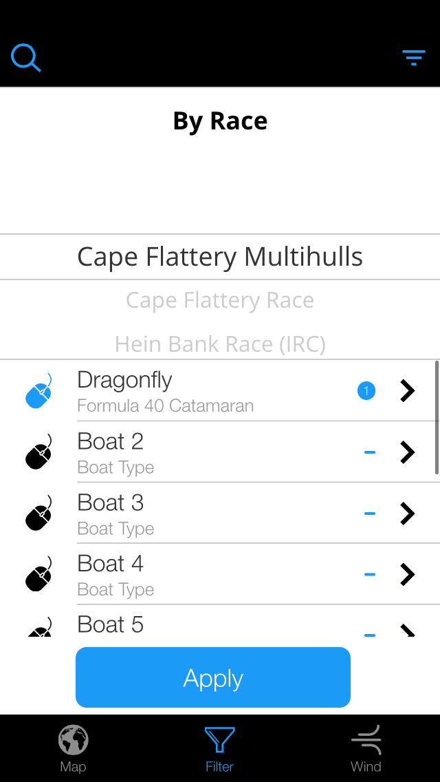
- Filter – by boat and by race
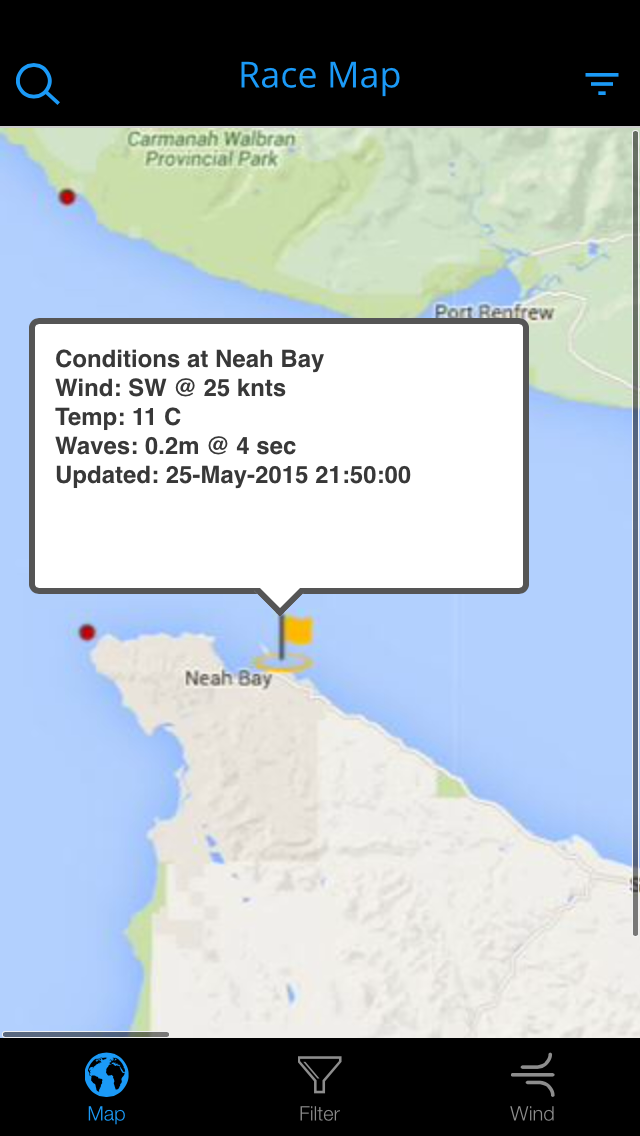
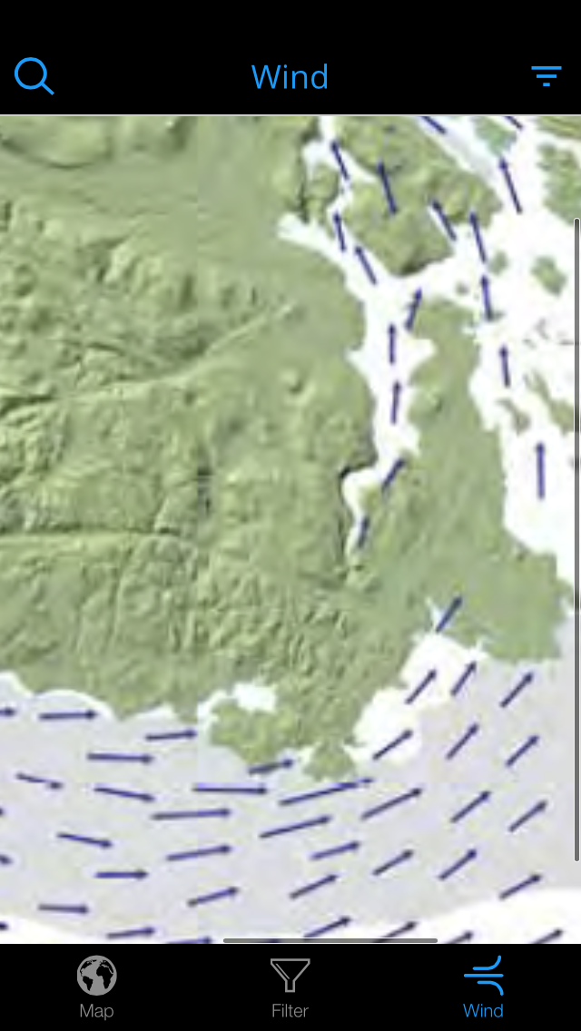
- Conditions – view current weather conditions at buoys, wind patterns, and current data
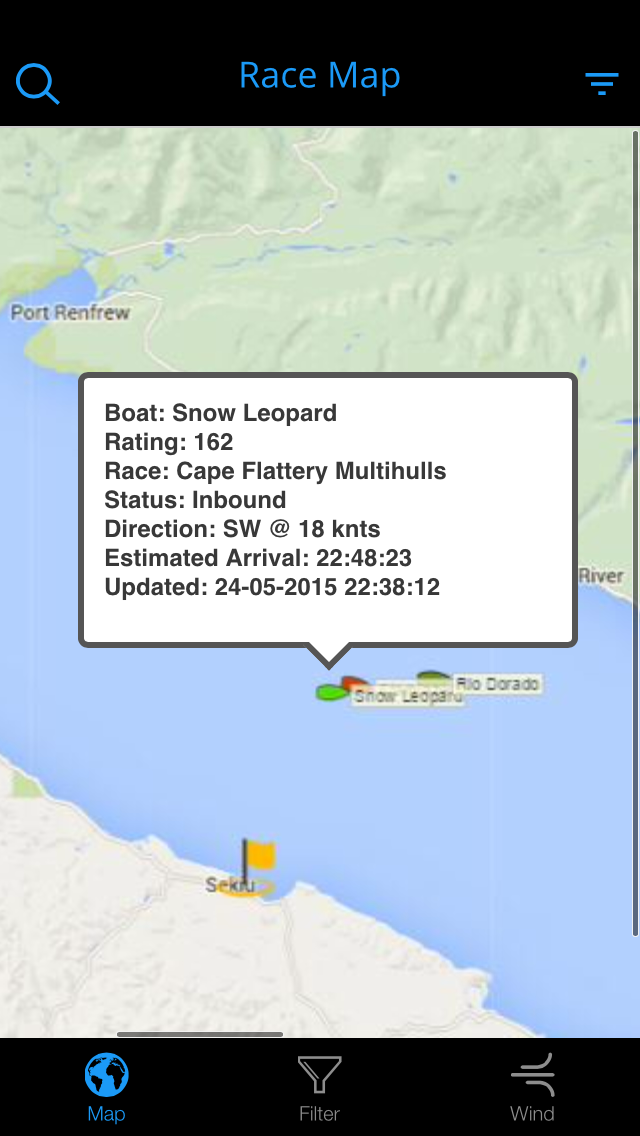
- Boat – view details about boat performance
- Social – connect with and view @SwiftsureRace twitter feed
- Clock – display actual time and race elapsed time
- ETA – doesn’t currently exist
This was a lot to incorporate into an app over one weekend, but I attempted to include as much as possible.
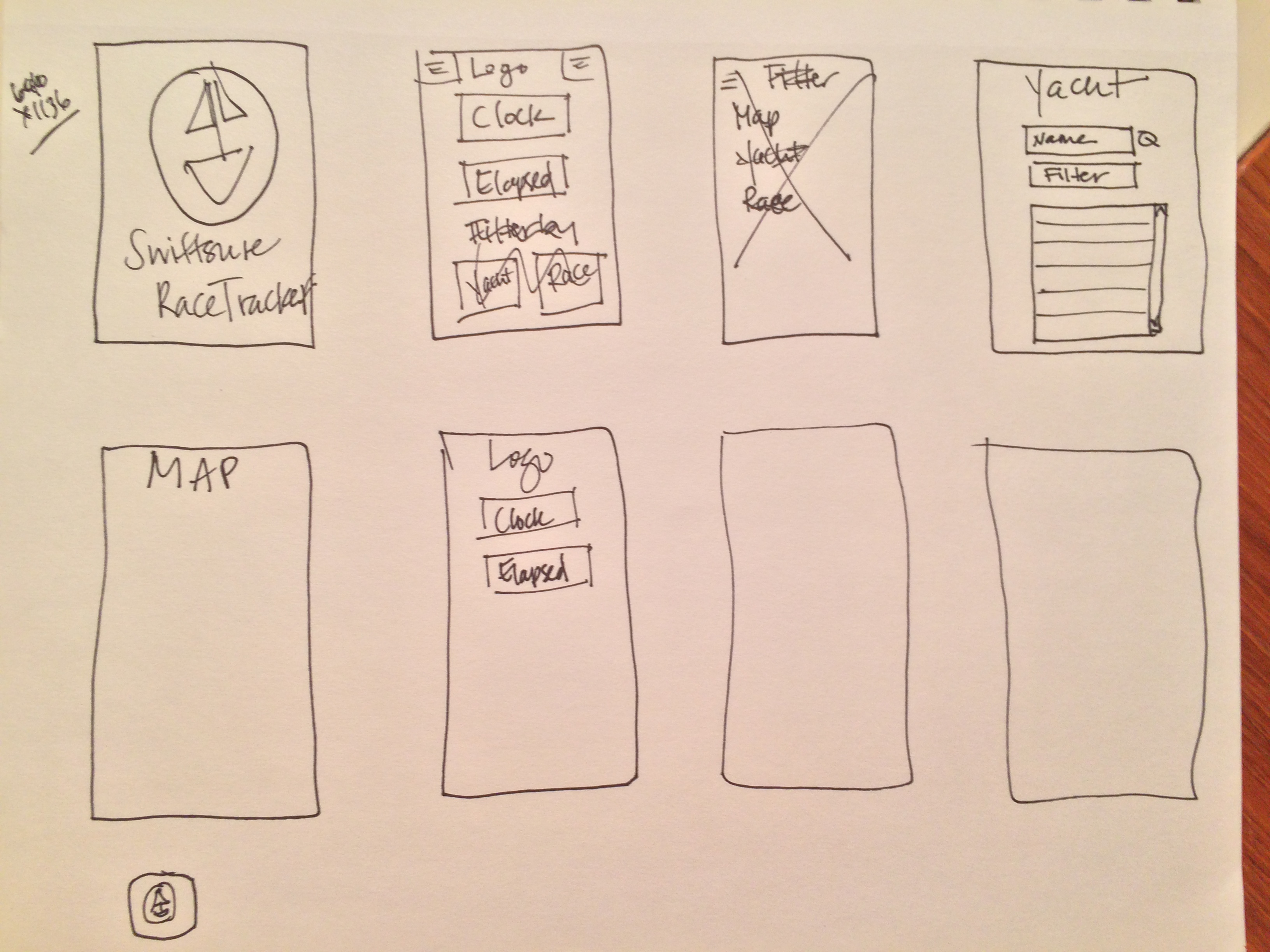
Sketching
Below are some of my initial sketches for the design. 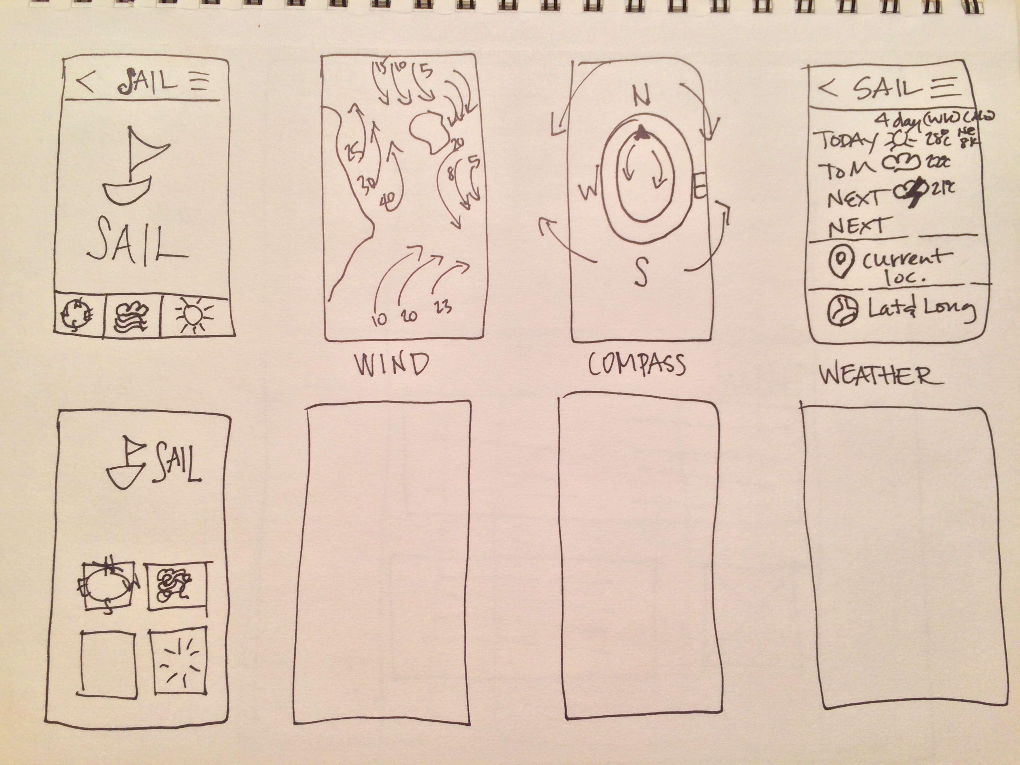
Prototyping
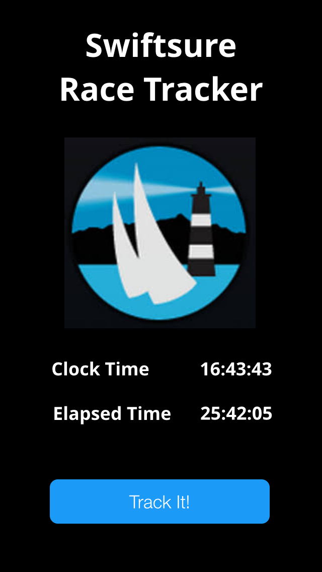
I chose to use proto.io for the prototype so I could learn to use a new tool. It ended up being a great learning opportunity and a great match for the prototype. What I was able to include:
- Map
- Filter
- Details on demand for boat
- Search panel
What needs further development:
- Wind map needs better interface with interactive key
- Include social tab to review/post Twitter feed
- Expand weather features to include currents
- This could overlay the current map, but should be tested on the small screen for usability
- Add in estimated time of arrival feature (based on current speed and conditions)

 Here is the link to the interactive prototype if you’d like to take a test drive: https://gailthynes.proto.io/share/?id=7fe067a8-cb8a-4814-981e-8695bce00c99&v=3 Here is the PDF version:
Usability Testing
I did some informal user testing by sending out the prototype to my Canadian friends for their initial impressions. I received a few insights about details that are desirable. The next steps would be refine the design and incorporate “further development” from above into the prototype. The owner of Dragonfly has offered to get me in touch with the Race Committee so I can show them my app to see if they are interested in developing. For more information about Dragonfly visit her website.