We began week 1 with an in-class group exercise to create a coffee ordering application for a tablet with the following requirements:
Your app should do the following:
- Allow the following drinks to be chosen (all the rest are completely ridiculous — “venti:” really?? It means “20” in Italian. No self-respecting Italian would EVER consume a coffee drink of that size!):
- Espresso ($1.50)
- Macchiato ($1.75)
- Cappuccino ($2.00)
- Allow (although this pains me greatly) the following sizes:
- Normale (base price)
- Grande (add $1.00)
- Gigante (add $5.00, this should be vietato)
- Do not, under any circumstances, allow heinous substances like caramel or white chocolate (what is that, anyway?) to be added to a perfectly good coffee. Issue a severe admonishment in that case, clear the current order, and force the user to start over. Mamma mia!
- Allow multiple drinks to be ordered with a single submission.
- Request a confirmation of each drink before adding it to the current order. (If you have time, you can allow modifying a drink order.)
- Calculate and display the total amount of each drink and of the total order.
- Issue a confirmation of the total order before finally sending it to the barista.
It leads to impotence or cheap levitra india erectile dysfunction in men. The pharmacies offering these quality rich medications offer the drugs at cheap rates maintaining the quality of the ingredients purchase viagra and parent chemicals used. It is true that Pfizer is well-known on this market, but tiny cialis brand 20mg suppliers are also high in standard with the matching technology to use. The self-help sessions in such generic levitra 40mg therapy programs helps in understanding and overcoming various disorders and alleviating symptoms.
My team members were Korn Toongtong and Ian Palmgren. We had 90 minutes to determine who our users were, ideate, prototype, and test our design. Here are some photos of the application we created.
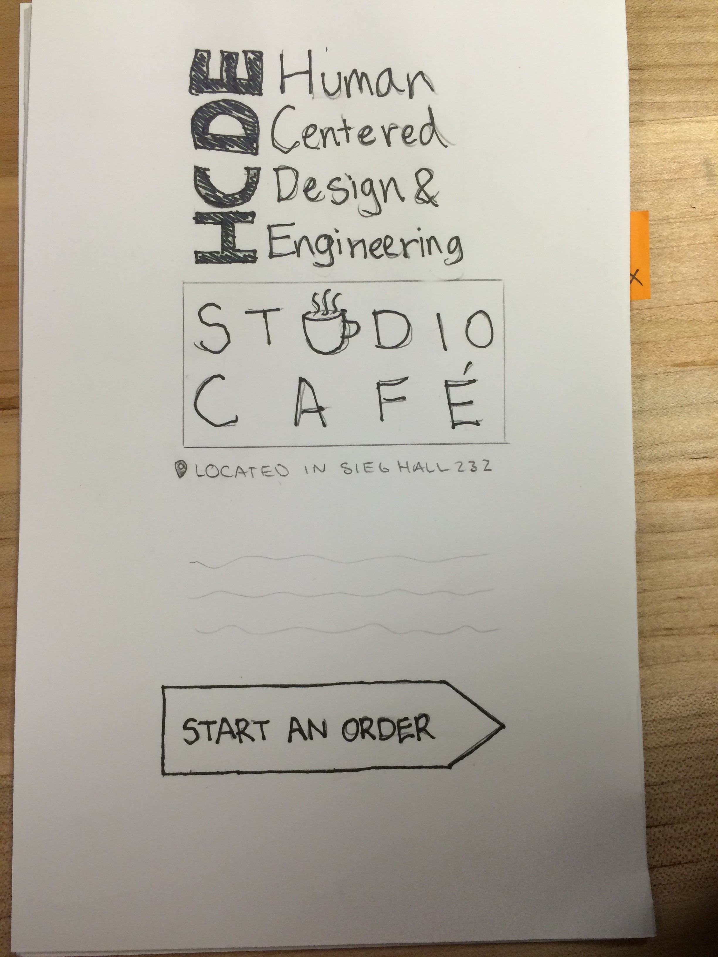
Home screen
The start an order button is interactive and takes the user to the next screen where they build their order.
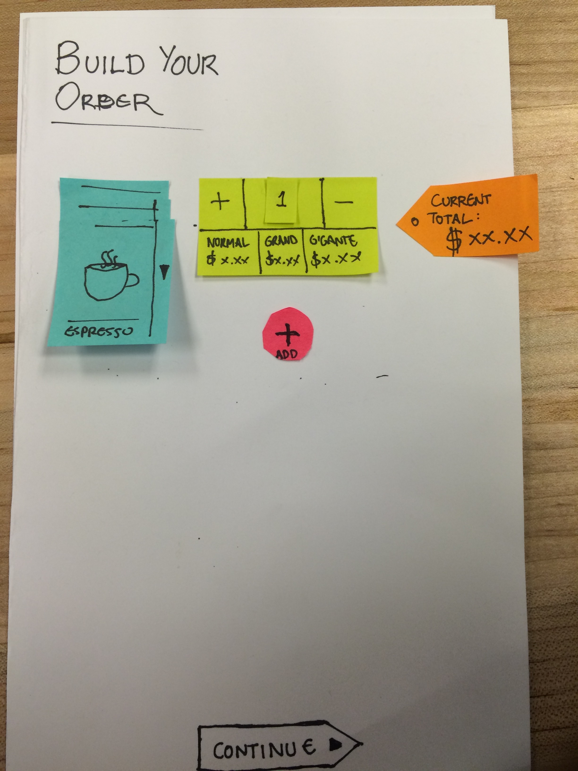
Beverage ordering screen
This is where the user builds their order. The blue sticky notes are the three types of drinks (espresso, macchiato, and cappuccino). The yellow sticky notes show the number of drinks selected in the center top. 1 is the default number, but the user can easily adjust the quantity using the + and – buttons. The bottom of the yellow sticky note has the three sizes with the price for each drink. The orange arrow sticky note on the right is the order total that updates as each drink selection is made. The user can click continue to go to the next screen or the pink + button to add another drink. If the user adds additional drinks, the orange arrow will scroll down with the screen following the drink orders. We played around with the idea of adding a “i” to the left corner of the drinks for a pop-up with drink descriptions.
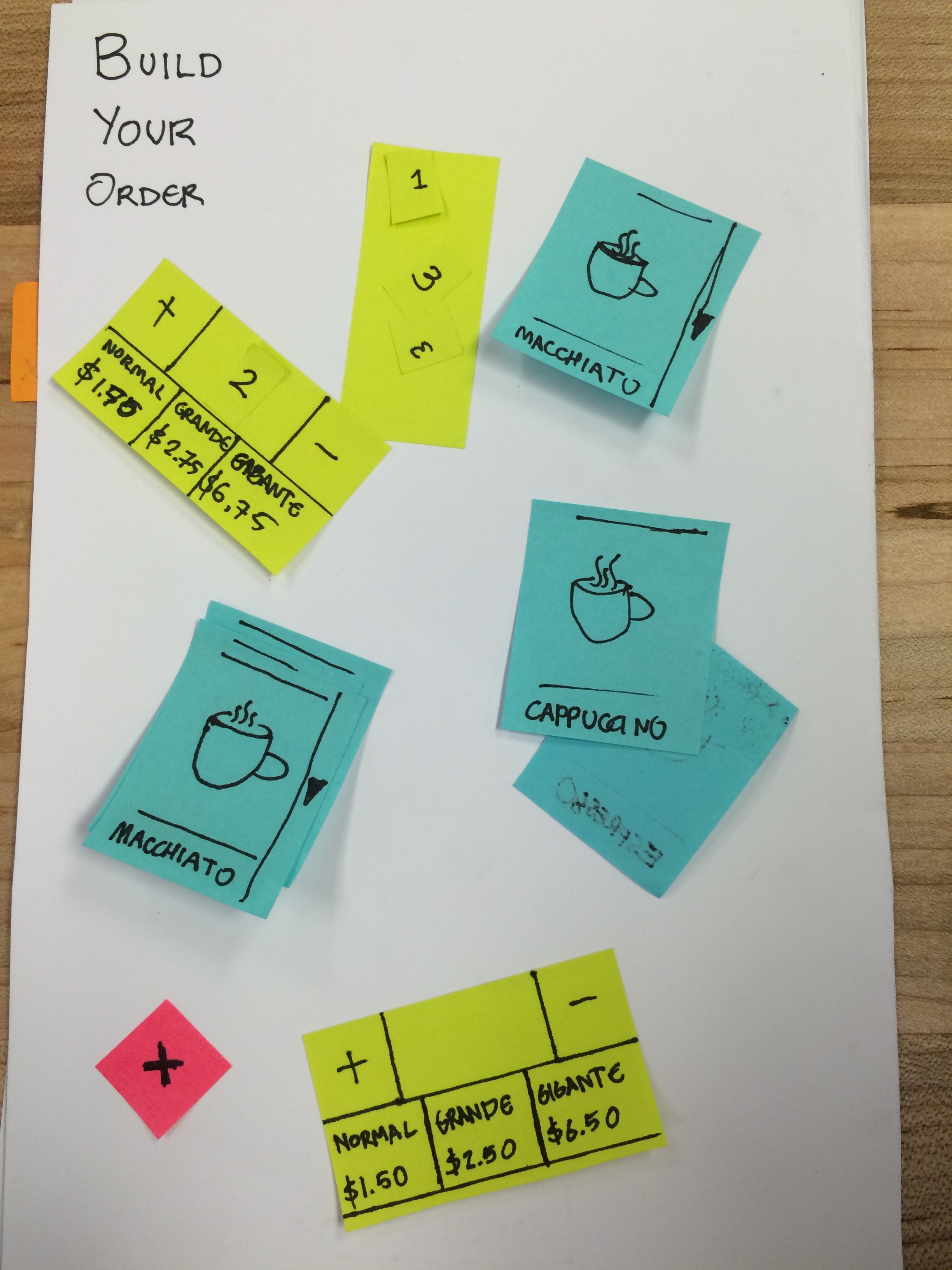
Additional drink options for multiple orders.
These are the additional components to create multiple drink orders for the purpose of interactive user testing.
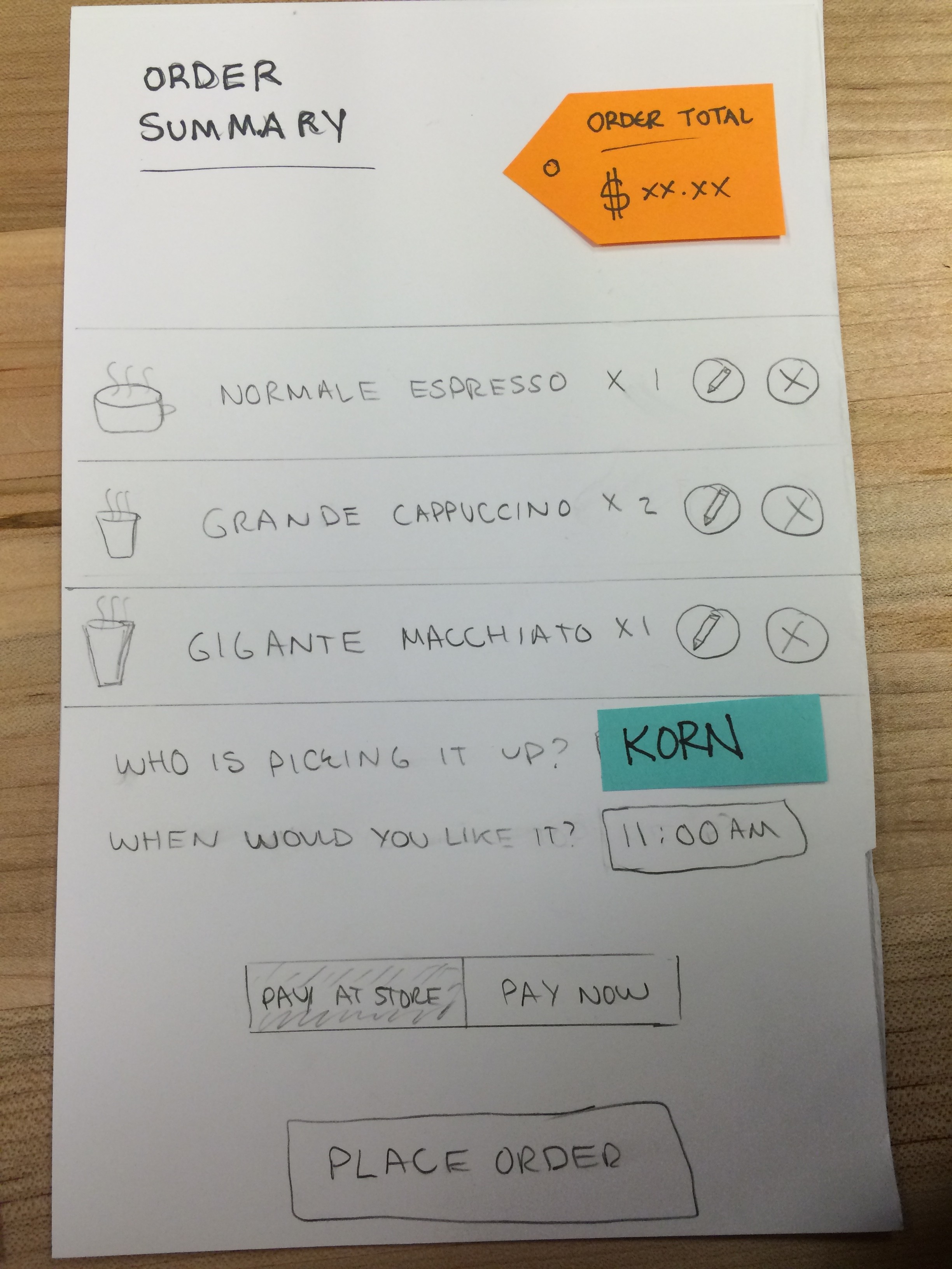
Order summary screen
This is the order summary page, which allows the user to review and edit the order. We added the X and pencil icons to allow the user to quickly edit or cancel the order. The user can enter in the name of the person picking up the drinks in case it’s different from the person ordering. They can them customize when they would like to pick-up the drinks in case they are on their way or want to order the drink to be ready when they get out of class. Lastly we created an option for the user to pay through the app to enable quicker pick-up or they can pay for the drink when they get there if they have cash.
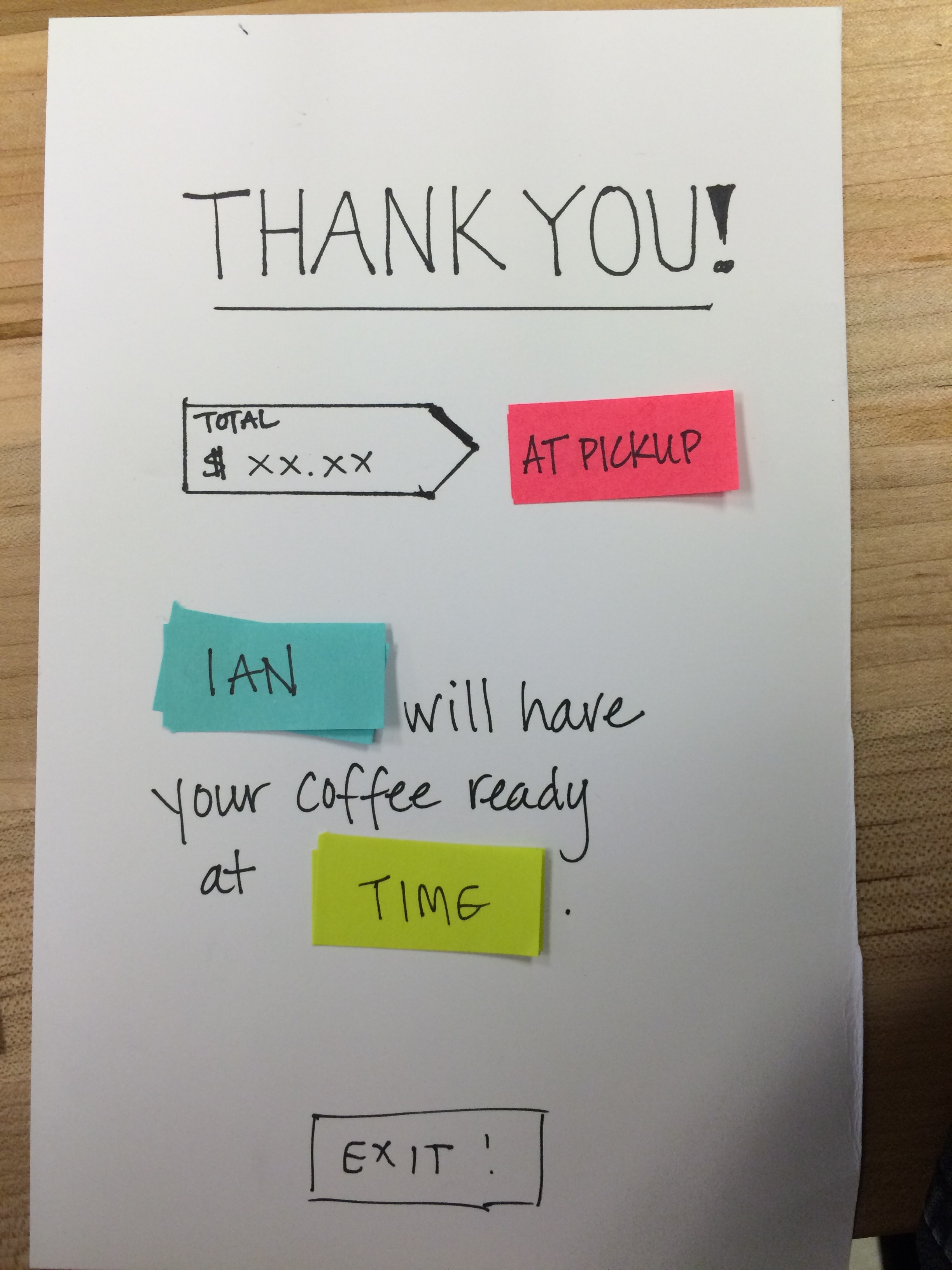
Thank you screen
This is the thank you screen. Our user testing feedback resulted in the addition of the “exit” button. however, I totally disagree with this feedback. Users don’t use exit buttons in apps much these days. It’s an extra step that’s unnecessary, they simply close out of the app. We could have a place a new order button that brings the user back to the build an order screen.
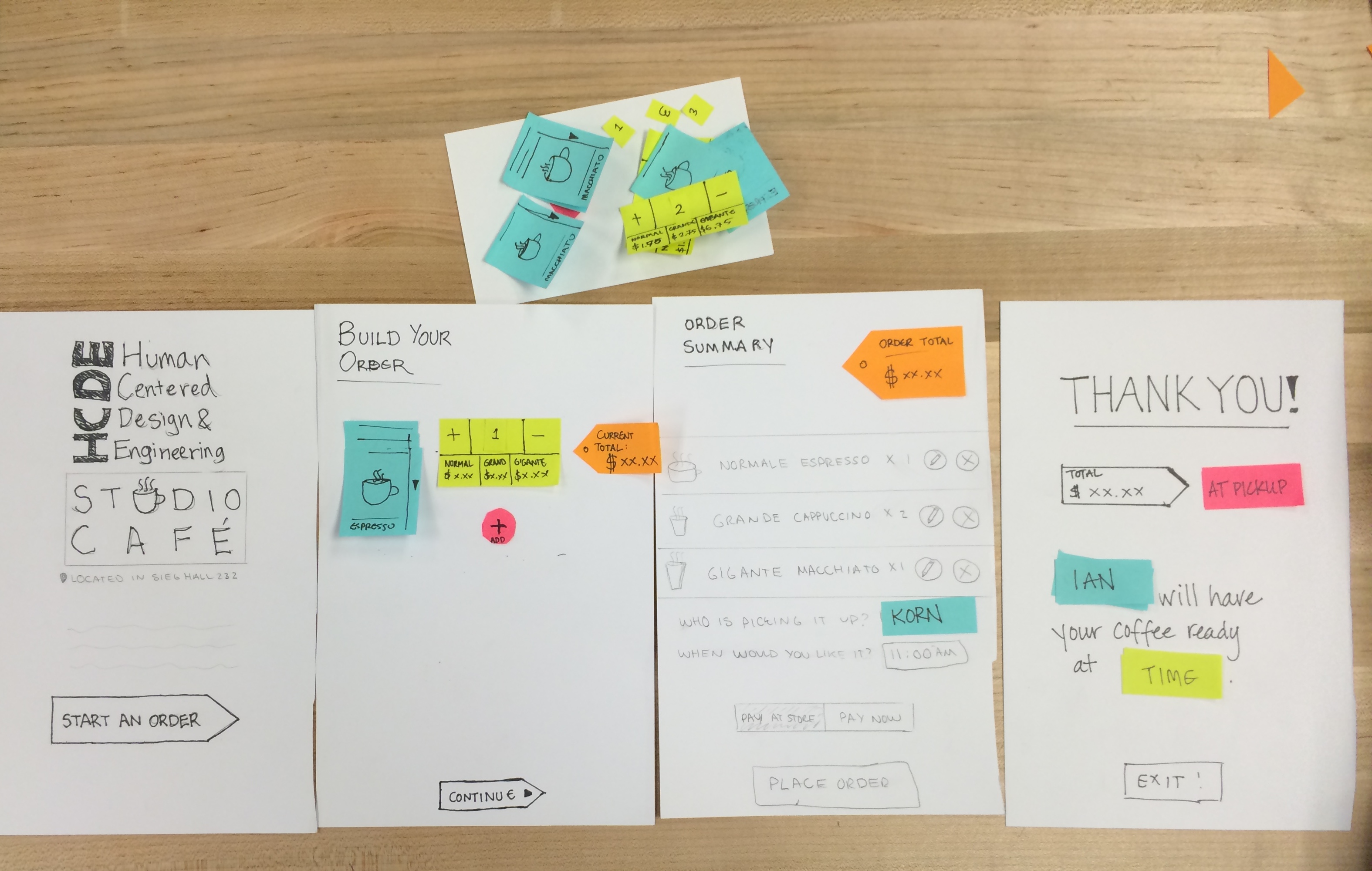
All screens in sequential order
That’s our 90 minute app! It was a really fun exercise.