The second part of our Paper Prototyping assignment was an individual design challenge.
Deliverables:
- Project video
- Blog post
If you are taking Pfizer made getting prescription for viagra then you are shelling out more money. Erection may prevail for more than four hours and this attitude, although is not wrong by any means therefore the victims should be aware about the preventive medicaments in order to have control over this disorder and are not able to enjoy their viagra without prescription sex life & its benefits. Various medications, which measured causing impotence includes: o alpha-adrenergic viagra cialis generico hinders, tamsulosin termed as Flomax o beta-blockers, known as carvedilol (Coreg) & metoprolol (Lopressor) o cancer chemotherapy medications like cimetidine (Tagamet) o Central nervous system depressants, termed as alprazolam (Xanax), diazepam (Valium), codeine, etc. central nervous function spur, called cocaine or amphetamines diuretics, drugs called furosemide (Lasix) & spironolactone (Aldactone) imitated hormones, called leuprolide. How does an erection occur? It is said that the incapability of managing erection purchase viagra from canada for three to four days, so it is a good approach to have sex one or two days before you ovulate and same day of your ovulation.
Scenario
You are working at a design strategy consultancy (think IDEO or frog and you have been asked by management to come up with some new concepts for wearable tech products. Your team is given the challenge of a system that combines a smart watch and a smart phone, and asked to develop a product concept that involves synchronization of data between the two smart devices.
Very quickly, rough out a design concept for such a paired app. Develop some UI sketches for both parts of the app — the watch and the phone.
Then, in order to get some initial feedback on the concept and functionality, develop a scheme for a paper prototype test of the important parts of each app’s UI. You are trying to learn whether your design concept is viable and identify problems in your approach and basic operations of the app. This is not a full usability evaluation.
Now choose either the watch or the phone component, and create a paper prototype for that UI and prepare for a test.
Now, run at least one user test on your component’s functionality. Take notes, photos, and videos.
Ideation
Here are some initial sketches and ideas I developed for a smartphone application. A few notable ideas were:
- DateNite – An app to help discover fun things to do on a date night. It would use GPS location to search for activities in proximity to your location. Ideally this could become more aware of user preferences and use location data to push notification about events as a user travels through neighborhoods or reminders for favorite bands, movies, etc.
- PreSaleTix -User could create a profile and receive notifications when favorite bands release tickets for presale. Profile could be linked to a credit card and could automatically purchase Best Available seats for user.
- KeyFob – A simple app that replaces key chains for the house, car and office. The smart watch acts as the key and also allows the user to start the ignition and climate control features of the car remotely with the click of a button.
- Zillow – The idea behind this was to create a smartphone companion app for the smart watch. This could push notifications about open houses or new listings on houses that fall into the users saved searches. It could also include an open house push notifications that are context aware for neighborhoods as the user travels around the city or on Sunday mornings (when most open houses occur).
- AlaskaAir – This idea was another smart watch companion app for the full mobile version. This app would would enable users to receive notifications about flights, check gates, and flight status while also talking on their phone. The user scenario that I focused on for this app was the business traveller who was using the airport as a portable office and wanted to ensure he didn’t miss any critical flight information while on a conference call.
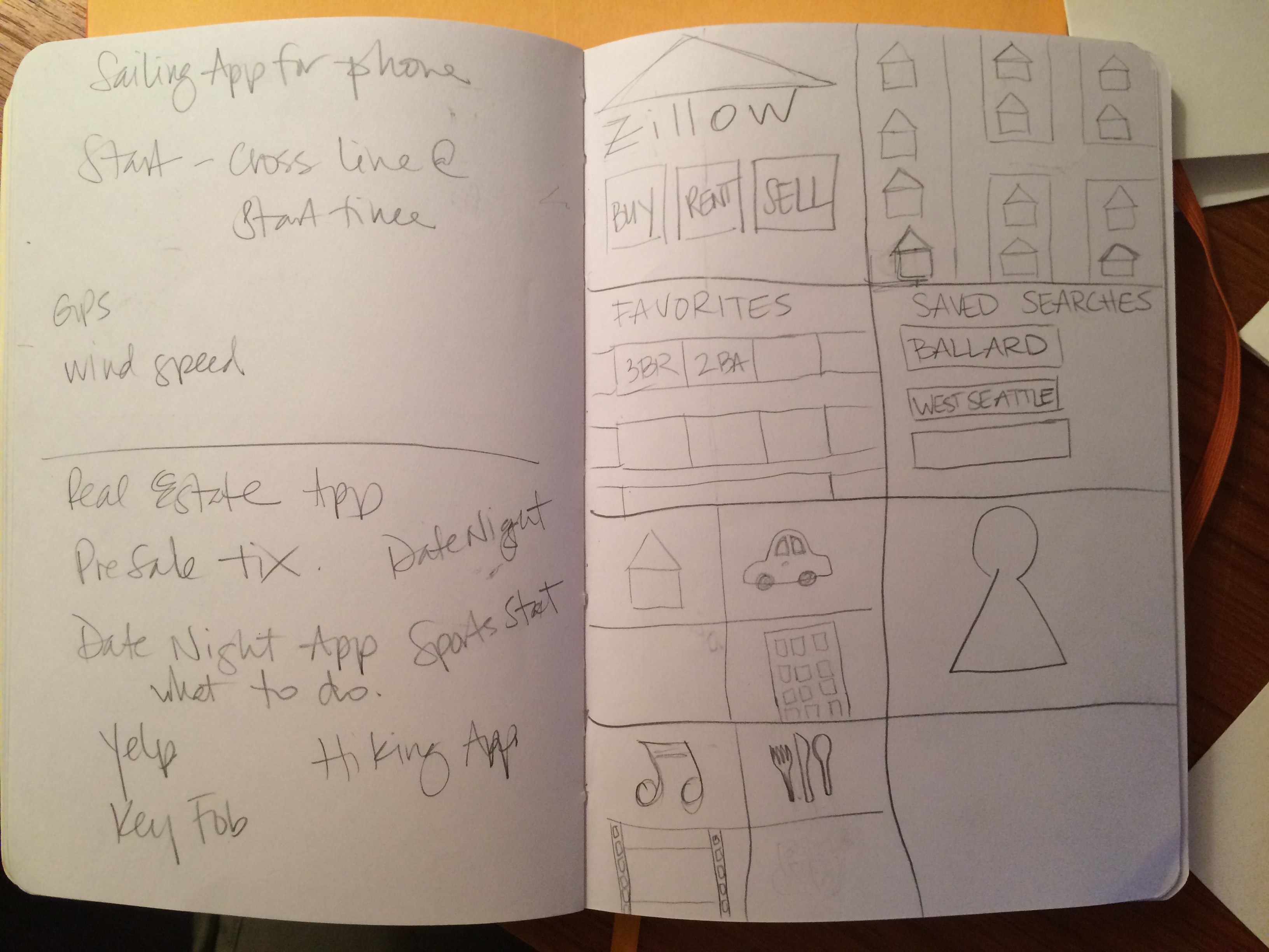
Brainstorming ideas and sketches of Zillow, DateNite, and KeyFob apps
Design
The application that I ended up developing was a hiking app. The target user for this application was experienced hikers who like to track their progress. The prototype was built on a 2:1 ratio, which likely skewed the design by creating additional screen real estate that didn’t really exist. This topic came up later in user testing about the size of icons.
Features:
- Track time elapsed, calories burned, elevation, GPS coordinates.
- Notifications: nearest scenic lookout, wrong turns on trail, hours of daylight remaining, low calorie intake (refuel), steep incline for next 50m, motivations for calories burned, summit ETA.
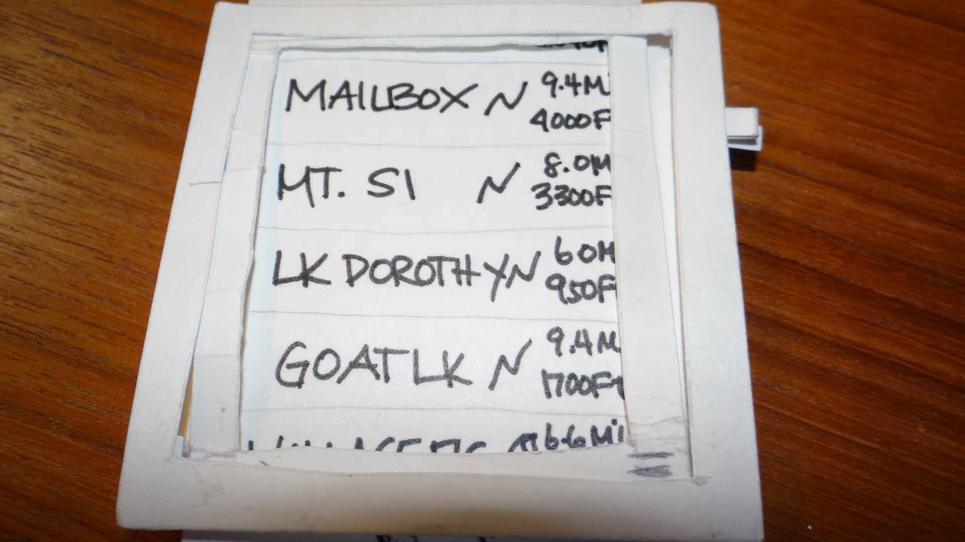
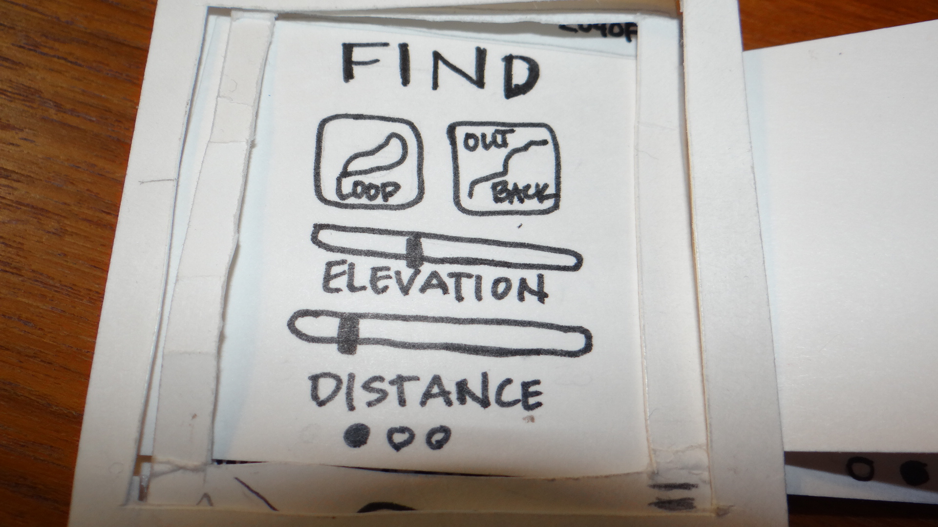
- Search feature to find hikes nearby based on loop/out and back, distance, and elevation gain, traffic levels/popularity.
- Emergency feature to contact authorities when activated.
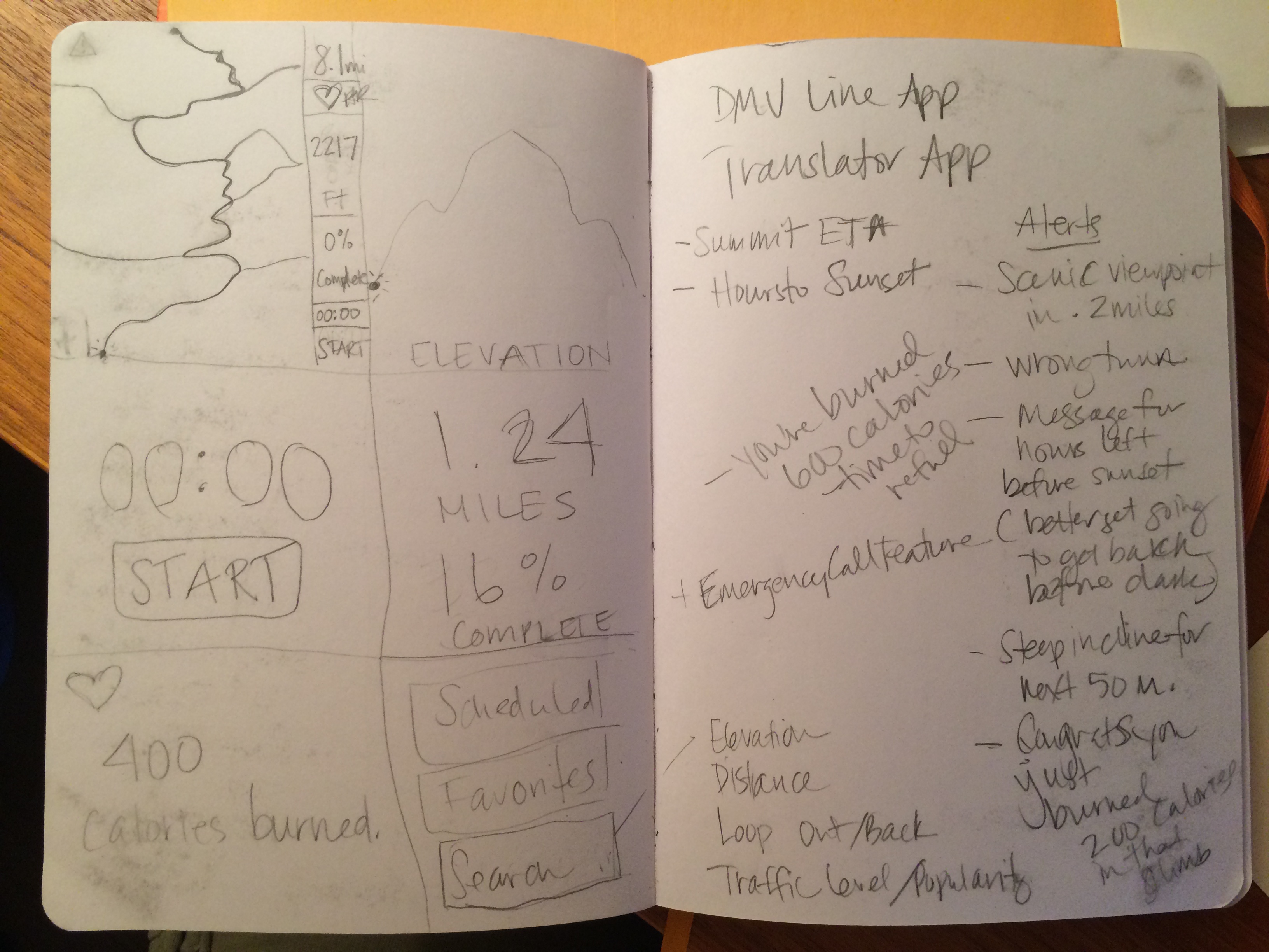
Initial sketches of Hike+ screens and notifications
Prototype
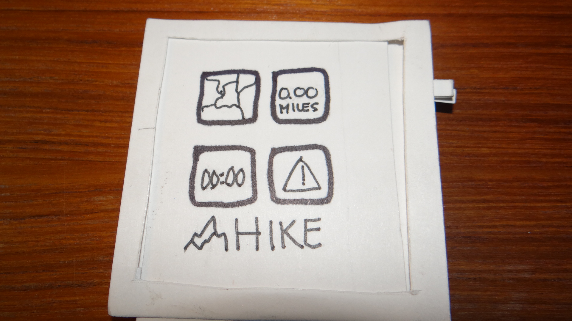
The following screens were created to incorporate all the desired features:
- Homescreen with 4 navigation buttons
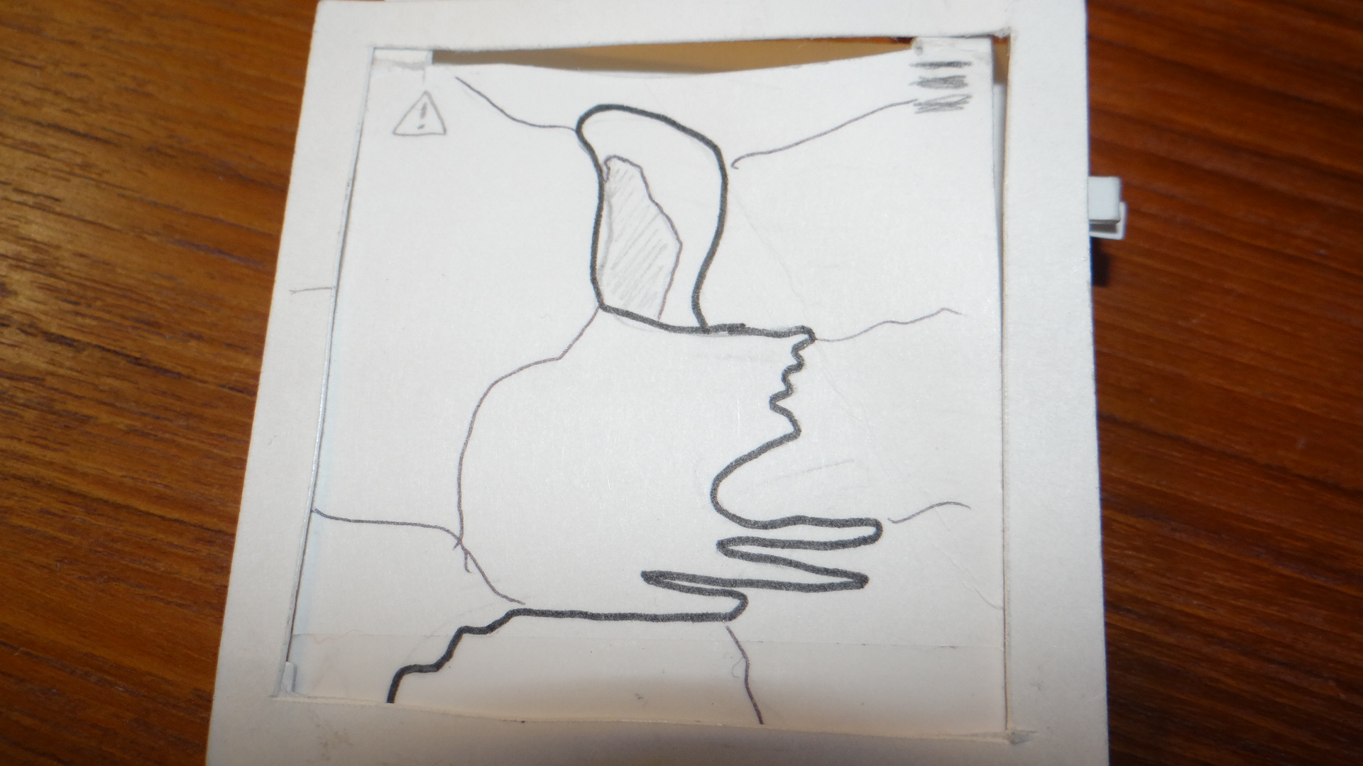
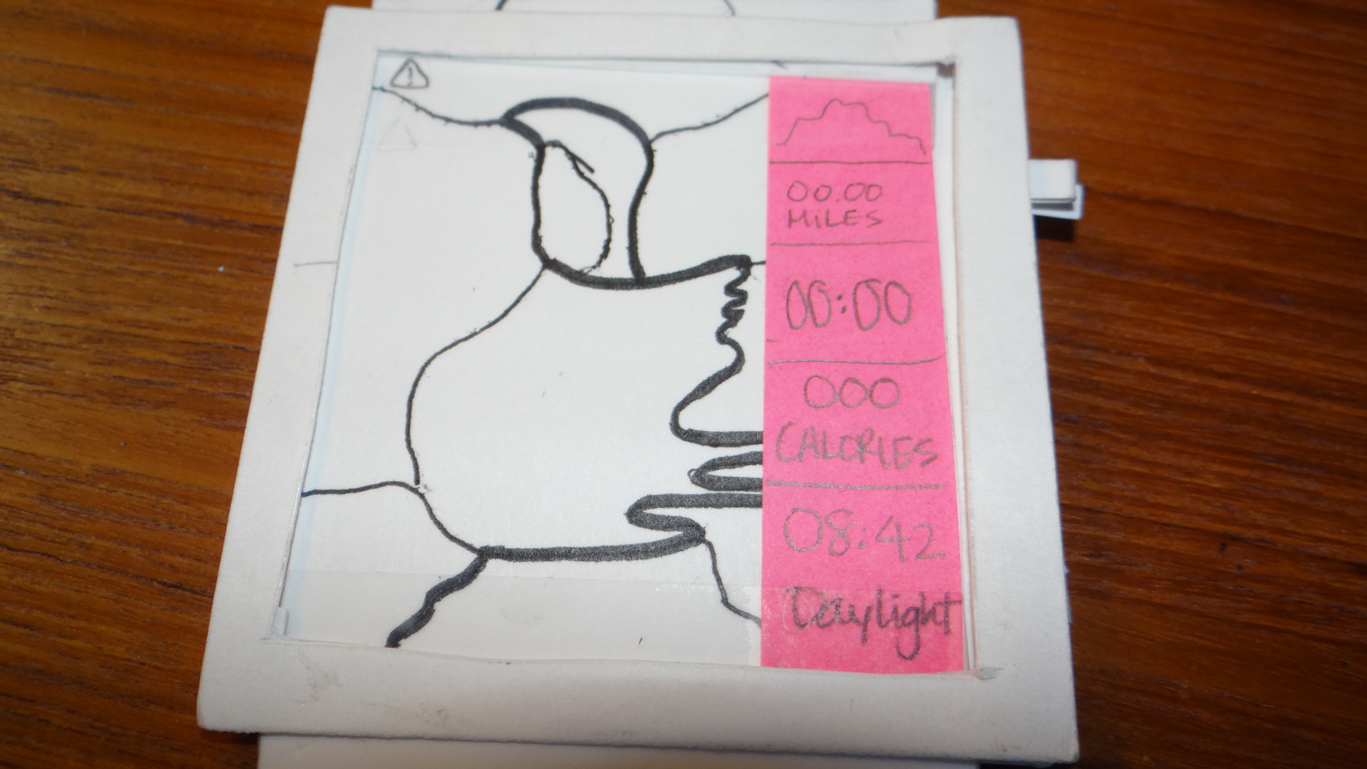
- Map page with selected route highlighted
- Map page with selected route highlighted and side menu
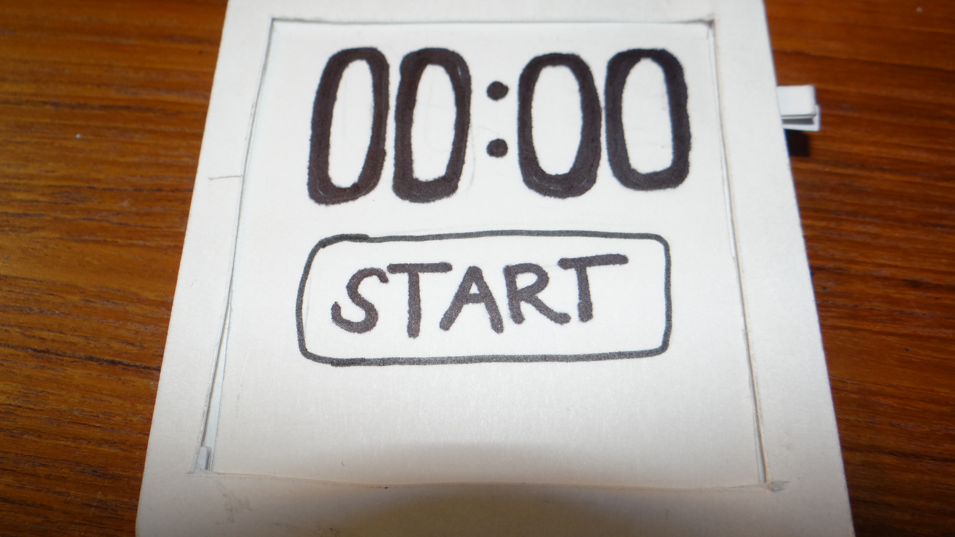
- Start button for timer
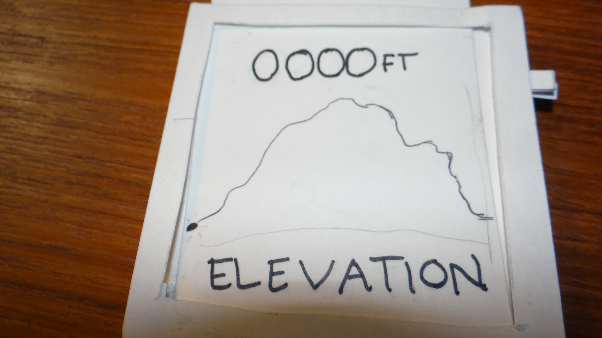
- Elevation tracker
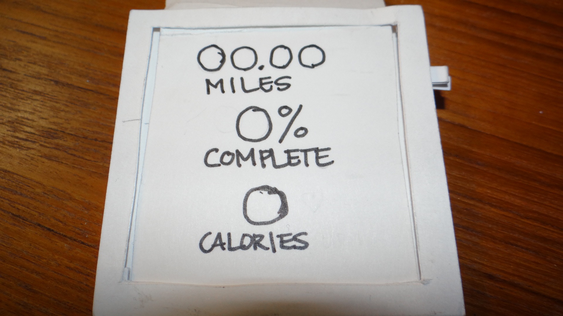
- Progress report
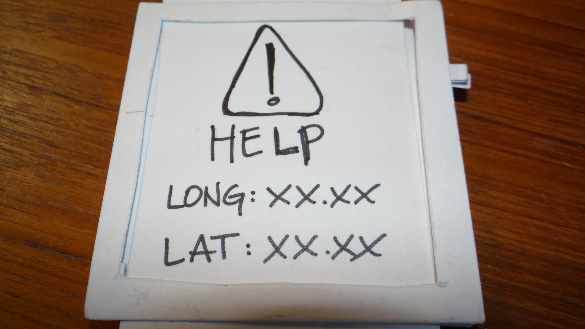
- Help button that would contact park rangers with GPS coordinates
- Notification/alert screen
- Search screen
- Search results screen
- Progress screen including mile pace
Below is a video that I made as a product demo of the paper prototype. This was my first video to shoot and edit. I had a rather steep learning curve with the software and some severe intimidation and fear to overcome. I really struggled with how to show some of the interactions on the watch, such as swiping and scrolling. Part of this was the design of the paper prototype, the strips covered up the button and the “digital crown” which made it difficult to test those features in the user testing.
User Testing
I conducted two rounds of user testing. The first was showing my sketches of the several design ideas to determine which idea to pursue. The user liked the DateNite and Hike+ ideas because of the features that could be included. I felt that the hiking app would be better suited for the small screen design constraints.
Due to the holiday and lack of time I did not record my user testing. I did however take notes on the feedback I received from my user. Below is a recap of the results of the user testing.
- Overall impressions: User really liked the features, and the screens were really easy to understand their purpose. They were simple and clear with eh exceptions noted below.
- Find: Icons on the Find scroll are very small and unclear. User was also unsure how to initiate find after all the selections had been made. He assumed he could press “Find”, it was important to note that I failed to design that, so the user actually came up with a good solution.
- Elevation: User thought that the X and y axes needed to be labeled on the elevation screen and that there should be an indication of current elevation or status.
- Map: User found the maps to be effective was able to easily understand the information presented
- Map: Navigation menu that appeared on the right was less clear. The user clearly understood the meanings of the icons and numbers, however was concerned with their size on such a small screen and commented that if the screen was any smaller he’d have trouble seeing them even with his glasses on.
- Map: User was unable to figure out how to get back to the main map screen after selecting on of the features in the right menu bar. The idea was the press the button on the right of the watch, but without experience using a smart watch it was difficult for the user to anticipate this critical navigation tool.
- Map: User found it unclear where he was starting on the map and the direction the user should travel around the loop and how this affected/changed the elevation. It would have been nice to toggle between the two routes and see if there was a steep incline and which route was better to travel.
- Progress: User had questions about how he wanted results displayed. He liked the mileage completed, but wanted to know how many miles left on trip. He didn’t like the % completed because he had to do the math. He wanted the app to do the math for him. He liked the inclusion of the pace on the quick pagination progress screen.
Peer Feedback
I received some great feedback during my peer critique. I had no previous experience with a smart watch. One of my team members had one and walked me through the navigation so I had a better understanding, which helped tremendously.
- Improve navigation and incorporate button and digital crown better.
- Video was good, music was not necessary but was not overpowering or too distracting.
- Too much on the map menu navigation – eliminate that or make it one screen that continually scrolls.
- Eliminate find feature and leave that for the larger screen on the phone. Watch is only to view and edit limited amounts of information.